1
我正在構建必須在「小」屏幕(1024 * 768)或更高分辨率屏幕上工作的應用程序。調整媒體查詢不起作用的項目大小
我在應用程序中有一個頁面,有一些項目呈現在兩列。但在「小」屏幕上,項目的寬度太大而不能保持良好的佈局,所以我想將列數減少到一個。該列使用<ul>構建,其中包含<li>和float:left屬性(這實際上是一個jQuery可排序插件輸出)。
我的網頁行爲是允許用戶在「源」列表和「目標」列表之間拖放項目以選擇項目(這是可行的,如果可以幫助,我可以粘貼代碼) 。
要解決此問題,我嘗試設置媒體查詢。
在我的CSS文件,我有:
.sourceItems, .targetItems {
    list-style-type: none;
    float: left;
    margin: 0;
    padding: 0;
    margin-right: 10px;
    background: #eee;
    padding: 5px;
    border: solid 1px black;
    height: 400px;
    overflow: auto;
}

.sourceItems {
    width: 530px;
}

.targetItems {
    width: 280px;
}

    .sourceItems li, .targetItems li {
     border: solid 1px black;
     float: left;
     margin: 4px;
     padding: 4px;
     width: 220px;
     min-height: 10px;
     cursor: move;
     background-image: url('/_layouts/images/personresult.gif') !important;
     background-repeat: no-repeat !important;
     padding-left: 20px;
     background-color: #DFEFFC;
     background-position: left center !important;
    }

     .sourceItems li.user, .targetItems li.user {
     }

     .sourceItems li.entity, .targetItems li.entity {
      background-position: left center;
      border: solid 1px black;
      float: left;
      margin: 4px;
      padding: 4px;
      width: 200px;
      background-image: url('/_layouts/images/peopletitle.png') !important;
      font-size: 1.1em;
      height: 50px;
      cursor: move;
      padding-left: 40px;
      background-color: #CCFF99;
      background-repeat: no-repeat !important;
      vertical-align: middle;
     }

@media screen and (max-width: 1024) {
    .sourceItems {
     width: 200px;
    }

    .targetItems {
     width: 200px;
    }

     .sourceItems li, .targetItems li {
      margin: 2px;
      padding: 2px;
      width: 180px;
      min-height: 10px;
      background-image: url('/_layouts/images/personresult.gif') !important;
      -moz-background-size: 50%;
      -o-background-size: 50%;
      -webkit-background-size: 50%;
      background-size: 50%;
      background-repeat: no-repeat !important;
      padding-left: 10px;
      font-size: 1.1em;
     }

      .sourceItems li.user, .targetItems li.user {
      }

      .sourceItems li.entity, .targetItems li.entity {
       -moz-background-size: 50%;
       -o-background-size: 50%;
       -webkit-background-size: 50%;
       background-size: 50%;
       margin: 2px;
       padding: 2px;
       width: 180px;
       background-image: url('/_layouts/images/peopletitle.png') !important;
       font-size: 1.1em;
       height: 30px;
       padding-left: 20px;
      }
}
然而,這使得沒有區別時,頁面加載(元素始終是兩列大)。
不知道,如果它可以幫助,但這裏是DOM的轉儲(從IE開發者工具):
<UL class="sourceItems droptrue ui-sortable" jQuery172019945692622544986="151">
    <LI class="ui-state-default entity" jQuery172019945692622544986="75">some item 1</LI>
    <LI class="ui-state-default entity" jQuery172019945692622544986="76">some item 2</LI>
    <LI class="ui-state-default entity" jQuery172019945692622544986="77">some item 3</LI>
    <LI class="ui-state-default entity" jQuery172019945692622544986="78">some item 4</LI>
    <LI class="ui-state-default entity" jQuery172019945692622544986="79">some item 5</LI>
    <LI class="ui-state-default entity" jQuery172019945692622544986="80">some item 6</LI>
    <LI class="ui-state-default entity" jQuery172019945692622544986="81">some item 7</LI>
    <LI class="ui-state-default entity" jQuery172019945692622544986="82">some item 8</LI>
</UL>
<UL class="targetItems droptrue ui-sortable" jQuery172024919617247411335="152"></UL>
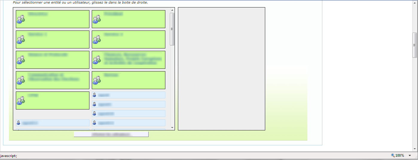
這裏是一個「大屏幕」輸出的截圖:
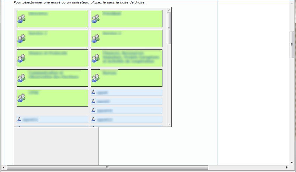
這裏是輸出的與 「小屏幕」 的屏幕截圖:
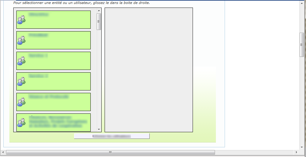
這裏是的屏幕截圖所期望的「小屏幕」上輸出(調整了DOM使用IE開發工具來產生截圖:
我明白任何幫助,可有助於解決這個問題。
我看到這是在您的示例中工作,但它不在我的應用程序中。我有一些問題:** 1。**如果定義一個規則(最大寬度),我還必須定義(最小寬度)?或者它處理一種默認樣式,由自定義規則覆蓋。 ** 2。**我將我的'@ media'規則放在一個css文件中。是否允許@media規則與古典css規則相同?或者我必須用我的'@ media'規則創建一個專用的css文件? ** 3。**我不確定寬度規則適用於哪個元素。它適用於屏幕尺寸還是元素尺寸? –
好的,我想出了爲什麼這不起作用。我的應用程序輸出一個使用IE 8引擎的IE 9渲染的'。而IE 8不支持媒體查詢,所以我的查詢被忽略。我會看看我是否可以在應用程序中更改它,但它不在這個問題的範圍之內。無論如何,謝謝你的回答。它實際上是解決方案的一部分 –