2010-06-10 53 views
1

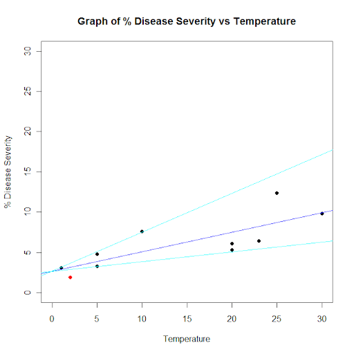
我有最適合線條繪製的數據。我需要畫另外兩條線。一個需要有兩倍的斜率,另一個需要有一半的斜率。後來,我將使用區域外面差異色點按: Conditionally colour data points outside of confidence bands in R在R中畫出兩條線,斜率是最佳擬合線的兩倍和一半的值。

示例數據集:

## Dataset from http://www.apsnet.org/education/advancedplantpath/topics/RModules/doc1/04_Linear_regression.html 

## Disease severity as a function of temperature 

# Response variable, disease severity 
diseasesev<-c(1.9,3.1,3.3,4.8,5.3,6.1,6.4,7.6,9.8,12.4) 

# Predictor variable, (Centigrade) 
temperature<-c(2,1,5,5,20,20,23,10,30,25) 

## For convenience, the data may be formatted into a dataframe 
severity <- as.data.frame(cbind(diseasesev,temperature)) 

## Fit a linear model for the data and summarize the output from function lm() 
severity.lm <- lm(diseasesev~temperature,data=severity) 

# Take a look at the data 
plot(
    diseasesev~temperature, 
    data=severity, 
    xlab="Temperature", 
    ylab="% Disease Severity", 
    pch=16, 
    pty="s", 
    xlim=c(0,30), 
    ylim=c(0,30) 
) 
title(main="Graph of % Disease Severity vs Temperature") 
par(new=TRUE) # don't start a new plot 
abline(severity.lm, col="blue") 
+2

是你確定這就是你真正想做的事情?你意識到這個界限基本上沒有意義,對吧? – hadley 2010-06-10 20:33:05

回答

4
diseasesev<-c(1.9,3.1,3.3,4.8,5.3,6.1,6.4,7.6,9.8,12.4) 

# Predictor variable, (Centigrade) 
temperature<-c(2,1,5,5,20,20,23,10,30,25) 

## For convenience, the data may be formatted into a dataframe 
severity <- as.data.frame(cbind(diseasesev,temperature)) 

## Fit a linear model for the data and summarize the output from function lm() 
severity.lm <- lm(diseasesev~temperature,data=severity) 

line1 <- severity.lm$coefficients * c(1,2) 
line2 <- severity.lm$coefficients * c(1,.5) 

df <- as.data.frame(severity.lm[[12]]) 
df2 <- adply(df,1,function(x) cbind(line1[2]*x[[2]]+line1[1], line2[2]*x[[2]]+line2[1])) 

plot(
    df2[df2[,1] >= min(df2[,c(3,4)]) & df2[,1] <= max(df2[,c(3,4)]),c(2,1)], 
    xlab="Temperature", 
    ylab="% Disease Severity", 
    pch=16, 
    pty="s", 
    xlim=c(0,30), 
    ylim=c(0,30) 
) 
title(main="Graph of % Disease Severity vs Temperature") 
par(new=TRUE) # don't start a new plot 
abline(severity.lm, col="blue") 
abline(line1, col="cyan") 
abline(line2, col="cyan") 
points(df2[df2[,1] < min(df2[,c(3,4)]) | df2[,1] > max(df2[,c(3,4)]),c(2,1)], pch = 16, col = 'red') 

alt text

5

你可以使用

# This gets the coefficients of the linear regression (intercept and slope) 
c <- coef(severity.lm) 
abline(c[1], c[2]*2, col="red") 
abline(c[1], c[2]/2, col="red")