2012-03-13 59 views
85

我有一個非常基本和已知的形式場景,我需要將輸入正確地與輸入對齊。但是我不知道該怎麼做。在輸入旁邊的表格中對齊標籤

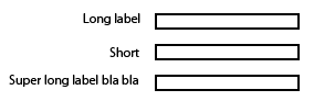
我的目標是將標籤對齊輸入到右側。這裏是所需結果的圖片示例。

enter image description here

我已經做了小提琴爲您提供方便,並澄清什麼,我現在有 - http://jsfiddle.net/WX58z/

段:

<div class="block"> 
 
    <label>Simple label</label> 
 
    <input type="text" /> 
 
</div> 
 
<div class="block"> 
 
    <label>Label with more text</label> 
 
    <input type="text" /> 
 
</div> 
 
<div class="block"> 
 
    <label>Short</label> 
 
    <input type="text" /> 
 
</div>

回答

138

一個可能的解決方案:

  • 給標籤display: inline-block;
  • 給他們一個固定的寬度
  • 對齊文本向右

即:

label { 
 
    display: inline-block; 
 
    width: 140px; 
 
    text-align: right; 
 
}​
<div class="block"> 
 
    <label>Simple label</label> 
 
    <input type="text" /> 
 
</div> 
 
<div class="block"> 
 
    <label>Label with more text</label> 
 
    <input type="text" /> 
 
</div> 
 
<div class="block"> 
 
    <label>Short</label> 
 
    <input type="text" /> 
 
</div>

JSFiddle

+1

怎麼辦如果某些標籤是複選框或單選按鈕,我會進行這項工作嗎?這些元素的標籤以與文本框標籤相同的固定寬度結束,這是不期望的。有沒有辦法在標籤上沒有固定寬度的情況下做到這一點? – 2014-01-14 12:15:38

+0

@RebeccaMeritz你的意思是當標記第一個複選框,然後標籤?您可以爲兩者添加一個類,並分別設置它們的樣式。也許你應該[問一個新的問題](http://stackoverflow.com/questions/ask)。 – bfavaretto 2014-01-14 14:34:34

7

我用類似這樣:

<div class="form-element"> 
    <label for="foo">Long Label</label> 
    <input type="text" name="foo" id="foo" /> 
</div> 

風格:

.form-element label { 
    display: inline-block; 
    width: 150px; 
} 
11

之前回答的問題,如這個,你可以看看,結果在這裏:

Creating form to have fields and text next to each other - what is the semantic way to do it?

所以同樣的規則適用於您的小提琴可以使用display:inline-block並排顯示您的標籤和輸入組,如下所示:

CSS

input { 
    margin-top: 5px; 
    margin-bottom: 5px; 
    display:inline-block; 
    *display: inline;  /* for IE7*/ 
    zoom:1;    /* for IE7*/ 
    vertical-align:middle; 
    margin-left:20px 
} 

label { 
    display:inline-block; 
    *display: inline;  /* for IE7*/ 
    zoom:1;    /* for IE7*/ 
    float: left; 
    padding-top: 5px; 
    text-align: right; 
    width: 140px; 
} 

updated fiddle

3

您也可以嘗試使用柔性盒

<head><style> 
body { 
    color:white; 
    font-family:arial; 
    font-size:1.2em; 
} 
form { 
    margin:0 auto; 
    padding:20px; 
    background:#444; 
} 
.input-group { 
    margin-top:10px; 
    width:60%; 
    display:flex; 
    justify-content:space-between; 
    flex-wrap:wrap; 
} 
label, input { 
    flex-basis:100px; 
} 
</style></head> 
<body> 

<form> 
    <div class="wrapper"> 
     <div class="input-group"> 
      <label for="user_name">name:</label> 
      <input type="text" id="user_name"> 
     </div> 
     <div class="input-group"> 
      <label for="user_pass">Password:</label> 
      <input type="password" id="user_pass"> 
     </div> 
    </div> 
</form> 

</body> 
</html> 
+0

這很漂亮,但根本不是他所要求的。請參閱op – Patrick 2017-03-25 17:37:08

2

雖然這裏的解決方案是可行的,但最近的技術已經取得了什麼,我認爲這是一個更好的解。 CSS Grid Layout允許我們構建更優雅的解決方案。

下面的CSS提供了一個2列「設置」結構,其中第一列預計是右對齊標籤,後面是第二列中的一些內容。更復雜的內容可以通過將其包裝在<div>中顯示在第二列中。

[作爲一個側面說明:我用CSS來添加的「:」落後每個標籤,因爲這是一個風格的元素 - 我的偏好。]

/* CSS */ 


div.settings { 
 
    display:grid; 
 
    grid-template-columns: max-content max-content; 
 
    grid-gap:5px; 
 
} 
 
div.settings label  { text-align:right; } 
 
div.settings label:after { content: ":"; }
<!-- HTML --> 


<div class="settings"> 
 
    <label>Label #1</label> 
 
    <input type="text" /> 


    <label>Long Label #2</label> 
 
    <span>Display content</span> 


    <label>Label #3</label> 
 
    <input type="text" /> 
 
</div>

+1

中的圖片嘿,你可以加一個小提琴嗎? – sed 2018-01-23 10:54:47

+0

是的,我已經更新了使用片段的答案。 – 2018-02-07 20:13:34

+0

這適用於FF,但不適用於Chrome – 2018-02-19 20:34:45