2015-06-04 28 views
2

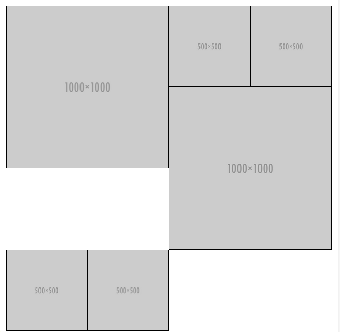
我試圖讓網格工作,因爲我想。它包含2種不同大小的元素,我希望它可以作爲砌體佈局,但不使用任何lib,因爲它是一個非常簡單的佈局,我無法擺脫困境。你看到圖像上的兩個小物品在它們漂浮時跳下。任何人都可以幫助我嗎?網格將會以同樣的結構重複。包含不同高度的div的CSS網格

參考圖像:

grid

.grid { 
 
    width: 100%; 
 
} 
 
.half { 
 
    float: left; 
 
    width: 50%; 
 
    max-width: 1000px; 
 
    border: 1px solid #000000; 
 
} 
 
.forth { 
 
    float: left; 
 
    width: 25%; 
 
    max-width: 500px; 
 
    border: 1px solid #000000; 
 
}
<section class="grid"> 
 
    <div class="half"> 
 
    <img src="http://placehold.it/1000x1000"> 
 
    </div> 
 
    <div class="forth"> 
 
    <img src="http://placehold.it/500x500"> 
 
    </div> 
 
    <div class="forth"> 
 
    <img src="http://placehold.it/500x500"> 
 
    </div> 
 
    <div class="half"> 
 
    <img src="http://placehold.it/1000x1000"> 
 
    </div> 
 
    <div class="forth"> 
 
    <img src="http://placehold.it/500x500"> 
 
    </div> 
 
    <div class="forth"> 
 
    <img src="http://placehold.it/500x500"> 
 
    </div> 
 
</section>

+0

你將需要JavaScript,我不認爲有一個純粹的CSS方式,如果有我想知道。 – aahhaa

+1

試試這個[CSS-only-masonary](http://w3bits.com/css-masonry/),並查看此[jsfiddle](https://jsfiddle.net/jalbertbowdenii/7Chkz/) – bbh

+0

是的,但它被限制在相同的寬度,或者一組固定的寬度。 – aahhaa

回答

3

哈利的答案作品真的很好,如果您正在使用此網格,整個網站這將是方法,我會去的,但如果你不希望再嵌套元素也許這將是一個簡單的解決方案。

只需將兩個div.fourth移動到第一個div.half的前面,然後將它們右移。然後漂浮右邊的第二個div.half,Bob的叔叔。

<section class="grid"> 
    <div class="forth right"> 
     <img src="http://placehold.it/500x500?text=block+1"> 
    </div> 
    <div class="forth right"> 
     <img src="http://placehold.it/500x500?text=block+2"> 
    </div> 
    <div class="half"> 
     <img src="http://placehold.it/1000x1000?text=block+3"> 
    </div> 
    <div class="half right"> 
     <img src="http://placehold.it/1000x1000?text=block+4"> 
    </div> 
    <div class="forth"> 
     <img src="http://placehold.it/500x500?text=block+5"> 
    </div> 
    <div class="forth"> 
     <img src="http://placehold.it/500x500?text=block+6"> 
    </div> 
</section> 

我也建議將box-sizing: border-boxinfo here

這也將更有意義的最大寬度從它應用到.grid並刪除它的孩子& make the img ‘responsive’

// Tidy up demo 
// ================================= 
* { 
    box-sizing: border-box; 
} 
// apply max width to image 
img { 
    max-width: 100%; 
    height: auto; 
    display: block; 
} 
// apply max width to grid container 
.grid { 
    max-width: 2000px; 
    width: 100%; 
    overflow: hidden; 
    margin: 0 auto; 
} 
// ================================= 

// orignal code 
// ================================= 
.grid { 
    width: 100%; 
} 

.half { 
    float: left; 
    width: 50%; 
    max-width: 1000px; // with a max width applied to the grid you don't need these lines 
    border: 1px solid #000000; 
} 

.forth { 
    float: left; 
    width: 25%; 
    max-width: 500px; // with a max width applied to the grid you don't need these lines 
    border: 1px solid #000000; 
} 
// ================================= 

// bit you need to add 
// ================================= 
.right { 
    float: right; 
} 
// ================================= 

// just so you can see the difference 
// ================================= 
.right { 
    background-color: #3cf; 
} 
.right img { 
    opacity: 0.8; 
} 
// ================================= 

最後我的榜樣on codepen http://codepen.io/samwalker/pen/MwpLvM?editors=110

+0

幹得好!我進一步編輯了自己的投資組合,但如果有人需要它,我只會分享代碼。 ** http://codepen.io/AartdenBraber/pen/dvbKxq** –

+0

**更好的版本**在這裏:http://codepen.io/AartdenBraber/pen/ZezMOm –

-2

要做到這一點不使用JavaScript,你需要考慮一下在列的條款。當你只處理一半和四分之一的時候,這是有效的,但如果內容的大小太動態,可能會變得複雜/不可能。這裏是一個簡化的例子(你必須玩弄利潤率)。

* { 
 
    margin: 0; 
 
    padding: 0; 
 
} 
 
.col, .col div { 
 
    display: inline-block; 
 
} 
 
.col { 
 
    width: 205px; 
 
}
<section class="col"> 
 
    <div class="half"> 
 
    <img src="http://placehold.it/205x205"> 
 
    </div> 
 
    <div class="fourth"> 
 
    <img src="http://placehold.it/100x100"> 
 
    </div> 
 
    <div class="fourth"> 
 
    <img src="http://placehold.it/100x100"> 
 
    </div> 
 
</section> 
 
<section class="col"> 
 
    <div class="fourth"> 
 
    <img src="http://placehold.it/100x100"> 
 
    </div> 
 
    <div class="fourth"> 
 
    <img src="http://placehold.it/100x100"> 
 
    </div> 
 
    <div class="half"> 
 
    <img src="http://placehold.it/205x205"> 
 
    </div> 
 
</section>

0

你必須巢網格。從兩個半格作爲兄弟姐妹開始,彼此相鄰。然後,你需要在左列中的內容需要在上半年進行,包括最後的2個四分之一格。然後從前兩個四分之一網格開始下半部分,並將其中的一半內容放入其中。

<section class="grid"> 
    <div class="half"> 
     <span class="contentLg">half A</span> 
     <div class="fourth"> 
      <span class="contentSm">fourth C</span> 
     </div> 
     <div class="fourth"> 
      <span class="contentSm">fourth D</span> 
     </div> 
    </div> 
    <div class="half"> 
     <div class="fourth"> 
      <span class="contentSm">fourth A</span> 
     </div> 
     <div class="fourth"> 
      <span class="contentSm">fourth B</span> 
     </div> 
     <div class="clear"></div> 
     <span class="contentLg">half B</span> 
    </div> 
</section> 

只要沒有默認邊距,嵌套網格應該可以正常工作。最好通過給出盒子大小來排列網格:border-box;填充(這將允許元素總寬度保持不變)。

如果你只需要添加的內容在半格走,不漂浮,你需要清除浮動(在我的例子中,我用一個div類「清除」)

當嵌套網格,百分比值將證明麻煩。最簡單的方法是使用像素寬度。在這個小提琴可以看到示例CSS。

http://jsfiddle.net/j0c7aL2c/

你必須與CSS的其他選項。你可以嘗試和改變嵌套網格的值,如下所示,但是當你處於螢火蟲中時,維護和混淆會很複雜。

.fourth {width:25%;} 
.half .fourth {width:50%} 

我建議使用像素寬度,並使用媒體查詢來調整響應式佈局的像素寬度。或者調整給定上下文的寬度,但要注意CSS命名空間增加了特性,並且可以使覆蓋網格容器更具挑戰性。

.half { width:480px;} 
/* Tablet - Portrait and Landscape */ 
@media only screen 
    and (min-device-width: 768px) 
    and (max-device-width: 1024px) 
    and (-webkit-min-device-pixel-ratio: 1) { 
    .half { width:240px;} 
} 

vs.

.half { width:480px;} 
.insideMyAwesomeContainer .half { width:240px;}