2013-03-20 36 views
4

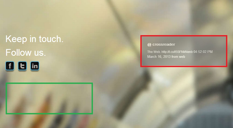
當窗口被調整大小時,我想將紅色邊框div放在綠色邊框所在的左側。
目前div有下面的CSS規則:如何在窗口大小調整時更改div的左邊距?

#twitter-2 { 
width: 332px; 
background-color: #7E7D7D; 
opacity: 0.6; 
margin-left:525px; 
margin-top:-142px; 
} 

http://imageshack.us/download/20/changemargin.jpg

我解決了這個問題:

window.onresize = function(event) { 
    var elem = document.getElementById("twitter-2"); 
    elem.setAttribute("style","margin: 20px 1px;"); 
} 
+0

紅色邊框在右邊,你的意思是你想要綠色邊框出現在紅色邊框在右邊的位置?另外,請發佈您的HTML。 – Lowkase 2013-03-20 12:53:20

+0

@Lowkase我認爲他意味着當頁面寬度減小時,將紅色突出顯示的div移動到綠色邊框突出顯示的位置。 – Antony 2013-03-20 12:54:58

+0

對不起,我想把紅色的邊框div放在3個按鈕下面,那裏是綠色邊框。 – 2013-03-20 12:55:28

回答

4

您可以使用媒體查詢

並重新測試您的網站 - 窗戶大小

調整你想要的設備是什麼,並總是試圖用%玩的不是PX的

一些媒體查詢爲您Thanks to Chris

/* Smartphones (portrait and landscape) ----------- */ 
@media only screen 
and (min-device-width : 320px) 
and (max-device-width : 480px) { 
/* Styles */ 
} 

/* Smartphones (landscape) ----------- */ 
@media only screen 
and (min-width : 321px) { 
/* Styles */ 
} 

/* Smartphones (portrait) ----------- */ 
@media only screen 
and (max-width : 320px) { 
/* Styles */ 
} 

/* iPads (portrait and landscape) ----------- */ 
@media only screen 
and (min-device-width : 768px) 
and (max-device-width : 1024px) { 
/* Styles */ 


Like This 
#twitter-2 { 
margin-left:Some Value ; 
margin-top:Some Value ; 
} 
    } 

/* iPads (landscape) ----------- */ 
@media only screen 
and (min-device-width : 768px) 
and (max-device-width : 1024px) 
and (orientation : landscape) { 
/* Styles */ 
} 

/* iPads (portrait) ----------- */ 
@media only screen 
and (min-device-width : 768px) 
and (max-device-width : 1024px) 
and (orientation : portrait) { 
/* Styles */ 
} 

/* Desktops and laptops ----------- */ 
@media only screen 
and (min-width : 1224px) { 
/* Styles */ 
} 

/* Large screens ----------- */ 
@media only screen 
and (min-width : 1824px) { 
/* Styles */ 
} 

/* iPhone 4 ----------- */ 
@media 
only screen and (-webkit-min-device-pixel-ratio : 1.5), 
only screen and (min-device-pixel-ratio : 1.5) { 
/* Styles */ 
} 
1

嘗試像

CSS

.red { 
    width: 332px; 
    background-color: #7E7D7D; 
    opacity: 0.6; 
    margin-left:525px; 
    margin-top:-142px; 
} 

.green { 
    width: 332px; 
    background-color: #7E7D7D; 
    opacity: 0.6; 
    margin-left:25px; 
    margin-top:-342px; 
} 

假設您目前有twitter-2 divclass red

window.resize function

$(window).resize(function(){ 
    $('#twitter-2').addClass('green').removeClass('red'); 
}); 

而且您可以根據需要不同width做到這一點。

http://api.jquery.com/resize/

+0

這對我有效:window.onresize = function(event){ var elem = document.getElementById(「twitter-2」); elem.setAttribute(「style」,「margin:20px 1px;」); } – 2013-03-20 13:20:07

1

只是把整條生產線的容器上比浮動左右,當空間太小的箱子底下會自然去。

<div class="row"> 
    <div class="follow">keep in touch</div> 
    <div class="tweet-update">bla bla</div> 
</div> 

.follow {float:left; margin-bottom:30px;} 
.tweet-update {float:right} 
相關問題