0
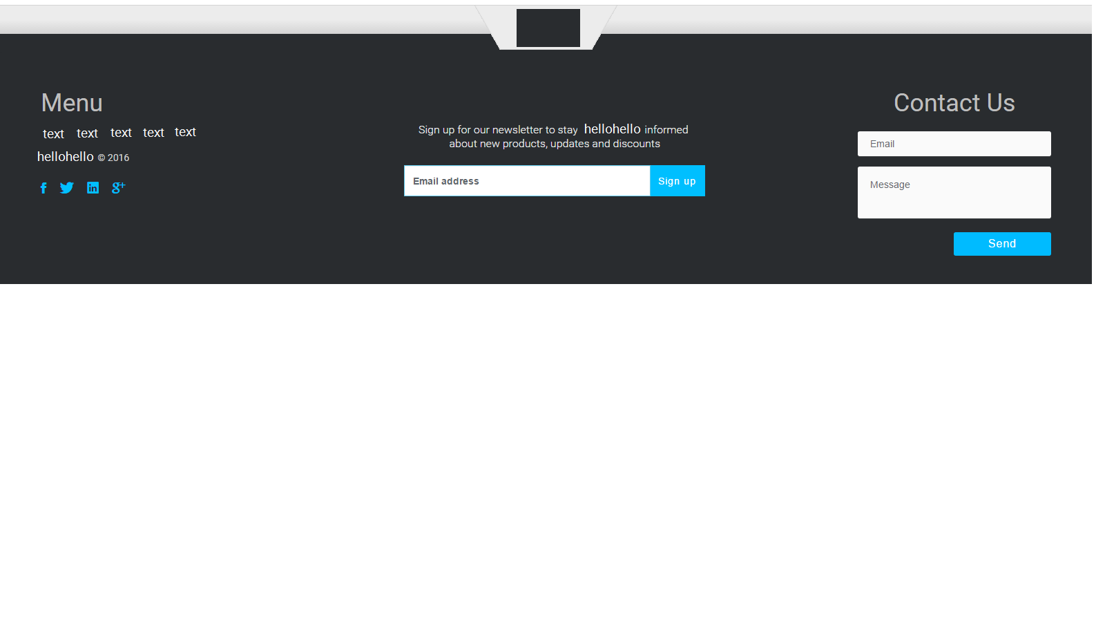
我試圖讓註冊表格的頁腳在頁腳的中間恰好居中的中部;在頁腳的左側和右側之間。如果我嘗試使用push,pull或offset類,則左側太遠。它似乎在一個方向上有點太過分了。我正在使用html5,css3和bootstrap 3.上面,我附加了我想要的樣子的圖像。
<footer class="footer-distributed">
<div class="footer-left">
<h3>Menu</h3>
<p class="footer-links">
<a href="#">text</a> •
<a href="#"> text </a> •
<a href="#"> text </a> •
<a href="#"> text </a> •
<a href="#"> text </a>
</p>
<p class="footer-company-name"> <a href="http://www.hellohello.com">hellohello</a><span> © 2016</span></p>
<div class="footer-social">
<!-- Social Media -->
<ul class="social">
<li>
<a href="http://wwww.fb.com/hellohello" class="Facebook">
<i class="ion-social-facebook"></i>
</a>
</li>
<li>
<a href="http://wwww.twitter.com/ hellohello " class="Twitter">
<i class="ion-social-twitter"></i>
</a>
</li>
<li>
<a href="#" class="Linkedin">
<i class="ion-social-linkedin"></i>
</a>
</li>
<li>
<a href="http://wwww.fb.com/ hellohello " class="Google Plus">
<i class="ion-social-googleplus"></i>
</a>
</li>
</ul>
</div>
</div>
<div class="col-md-6 col-sm-6 col-xs-12 col-sm-push-center ">
<div class=" subscribe-foot section-wrapper">
<p class="subscribe-nowfoot">
Sign up for our newsletter to stay hellohello informed
<br>about new products, updates and discounts
</p>
<div class="col-md-8 col-sm-8 col-xs-12 col-sm-push-2">
<div class="input-group">
<input type="email" class="form-control border-radius" placeholder="Email address">
<span class="input-group-btn">
<button class="btn btn-form border-radius custom-sub-btn" type="button">Sign up</button>
</span>
</div>
<!-- /input-group -->
</div>
</div>
</div>
<div class="footer-right">
<p>Contact Us</p>
<form action="#" method="post">
<input type="text" name="email" placeholder="Email" />
<textarea name="message" placeholder="Message"></textarea>
<button>Send</button>
</form>
</div>
</footer>
CSS:
#footer {
    background-color: #292c2f;
}

.footer-distributed {
    background-color: #292c2f;
    box-shadow: 0 1px 1px 0 rgba(0, 0, 0, 0.12);
    box-sizing: border-box;
    width: 100%;
    font: bold 16px sans-serif;
    text-align: left;
    padding: 50px 60px 40px;
    margin-top: 0px;
    overflow: hidden;
}


/* Footer left */

.footer-distributed .footer-left {
    float: left;
}


/* The company logo */

.footer-distributed h3 {
    color: #bebebe;
    font: normal 36px 'roboto', sans-serif;
    margin: 0 0 10px;
}


/* Footer links */

.footer-distributed .footer-links {
    color: #00bfff;
    font-weight: 400;
    margin: 0 0 10px;
    padding: 0;
}

.footer-distributed .footer-links a {
    display: inline-block;
    line-height: 1.8;
    text-decoration: none;
    color: inherit;
}

.footer-distributed .footer-company-name {
    color: #00bfff;
    font-size: 14px;
    font-weight: normal;
    margin: 0;
}

.footer-distributed .footer-company-name span {
    color: #d1d1d1;
    font-size: 14px;
    font-weight: normal;
    margin: 0;
}

.footer-distributed .footer-company-name a {
    color: #00bfff;
}

.footer-distributed .subscribe-nowfoot {
    color: #eaeaea;
    font-size: 16px;
    line-height: 20px;
    text-align: center;
    margin-bottom: 20px;
    font-weight: 300;
    margin-left: 0px;
    margin-right: 0px;
    padding-right: 0px;
    padding-left: 0px;
}

.footer-distributed .btn-form:hover,
.footer-distributed .btn-form:active {
    border: 1px solid #00bfff;
    background-color: #fff;
    color: #00bfff;
}

.footer-distributed .custom-sub-btn {
    background-color: #00bfff;
    color: #fff;
    border-color: #00bfff;
    transition: all .4s ease-in-out;
    letter-spacing: 1px;
    margin-top: 1px;
}

.footer-distributed .custom-sub-btn:hover {
    color: #00bfff;
    background: #fff;
    border-color: #00bfff;
    font-weight: 500;
    letter-spacing: 1px;
}

.subscribe-foot {
    text-align: center;
    margin-top: 0px;
    padding-top: 0px;
}


/* Footer Right */

.footer-distributed .footer-right {
    float: right;
}

.footer-distributed .footer-right p {
    text-align: center;
    vertical-align: top;
    margin: 0px 0px 20px 0;
    color: #ffffff;
    color: #bebebe;
    font: normal 36px 'roboto', sans-serif;
}


/* The contact form */

.footer-distributed form {
    display: inline-block;
}

.footer-distributed form input,
.footer-distributed form textarea {
    display: block;
    border-radius: 3px;
    box-sizing: border-box;
    background-color: #fafafa;
    box-shadow: 0 1px 0 0 rgba(255, 255, 255, 0.1);
    border: none;
    resize: none;
    font: inherit;
    font-size: 14px;
    font-weight: normal;
    color: #969696;
    width: 280px;
    padding: 18px;
}

.footer-distributed::-webkit-input-placeholder {
    color: #5c666b;
}

.footer-distributed::-moz-placeholder {
    color: #00aaff;
    opacity: 1;
}

.footer-distributed:-ms-input-placeholder {
    color: #00aaff;
}

.footer-distributed form input {
    height: 20px;
    margin-bottom: 15px;
}

.footer-distributed form textarea {
    height: 75px;
    margin-bottom: 20px;
}

.footer-distributed form button {
    border-radius: 3px;
    background-color: #00bbff;
    color: #ffffff;
    border: 0;
    padding: 8px 50px;
    font-weight: 500;
    float: right;
    letter-spacing: 1px;
}

.footer-distributed form button:hover {
    border-radius: 3px;
    background-color: #ffffff;
    color: #00bbff;
    border: 2px solid #00bfff;
    padding: 8px 50px;
    font-weight: 500;
    float: right;
    letter-spacing: 1px;
}
完美曾任職!謝謝 – Classics07