0
我是新的HTML CSS,我很困惑與通知欄這應該是響應採用全屏幕時,它是在mobile.But我試過它不擴大。 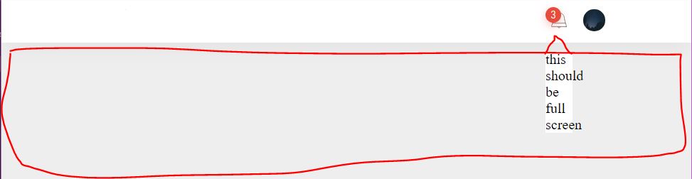 如何用絕對位置覆蓋父寬度?
但對我來說,這是行不通的
HTML標記
<!doctype html>
<head>
    <meta charset="utf-8">


    <meta http-equiv="X-UA-Compatible" content="IE=edge,chrome=1">
    <title></title>
    <meta name="description" content="">
    <meta name="viewport" content="width=device-width, initial-scale=1">

    <link rel="stylesheet" href="css/InterestPage.css">


</head>
<body>
<!--[if lt IE 8]>
<p class="browserupgrade">You are using an <strong>outdated</strong> browser. Please <a href="http://browsehappy.com/">upgrade your browser</a> to improve your experience.</p>
<![endif]-->

<header>
    <div class="innerwrapper">
     <h1><a href="#">Feel Hunt</a></h1>
     <div class="otherOptions">

      <div class="notificationdiv">
      <div class="notifyCoun">
       <p>3</p>
      </div>
       <svg style="enable-background:new 0 0 48 48;" version="1.1" viewBox="0 0 48 48" xml:space="preserve" xmlns="http://www.w3.org/2000/svg" xmlns:xlink="http://www.w3.org/1999/xlink"><style type="text/css">
    .st0{display:none;}
    .st1{fill:none;stroke:#303030;stroke-width:0.7;stroke-linecap:round;stroke-linejoin:round;stroke-miterlimit:10;}
    .st2{fill:#303030;}
</style><g class="st0" id="Padding__x26__Artboard"/><g id="Icons"><g><path class="st1" d="M12.44998,29.25c0.4714-1.86041,0.98683-3.71044,1.39399-5.58655 c0.20076-0.92508,0.37522-1.85624,0.50479-2.79409c0.12749-0.92277,0.12761-1.86938,0.32255-2.78069 c0.17715-0.82819,0.41986-1.62416,0.79385-2.38678c0.72808-1.48468,1.84795-2.76857,3.21698-3.69551 c1.54611-1.04685,3.39019-1.61638,5.25786-1.61638c2.6,0,4.96,1.06,6.66999,2.76999 c1.1685,1.1685,1.95078,2.64423,2.40368,4.22483c0.48483,1.69205,0.49984,3.44094,0.81387,5.16177 c0.41544,2.27656,1.13475,4.46739,1.71247,6.7034"/><path class="st1" d="M36.75998,35.78003H11.24002c-0.35004,0-0.60004-0.33002-0.5-0.67004L12.44998,29.25h23.09003 l1.71997,5.85999C37.36002,35.45001,37.11002,35.78003,36.75998,35.78003z"/><path class="st1" d="M22.39999,35.86509V36.32c0,0.71,0.58,1.29,1.29,1.29h0.93c0.71,0,1.29-0.58,1.29-1.29v-0.43993"/><path class="st1" d="M21.00458,13.27578c-1.74433,0.9948-3.03389,2.64047-3.76966,4.84763"/><line class="st1" x1="16.98094" x2="16.84722" y1="20.13664" y2="21.16766"/></g></g></svg>


//this is notifcation panel DIV
       <div class="notificationPanel">
        this should be full screen
       </div>


      </div>
      <div class="profilePicDrop">
       <img src="./img/sky-night-space-trees%20(4).jpeg" alt="">
       <div class="getDisplayNone dropDown">

        <a href="#">vdvdv</a>


       </div>

      </div>

     </div>
    </div>

</header>


</body>
</html>
Homepage.scss
@import "utils/_reset";
    @import url('https://fonts.googleapis.com/css?family=Roboto+Condensed:300,400');
    @import "utils/_variables";

    body{
     background: #EEEEEE;

    }
    header{
     width: 100%;
     position: fixed;
     height:50px;
     top:0;
     left:0;
     right: 0;
     background: #ffffff;
     box-shadow: 0px 11px 32px -1px rgba(0,0,0,.04);

     .innerwrapper{
     display: flex;
     align-items: center;
     justify-content: center;

     height: 50px;
     width: 75%;
     margin: 0 auto;


     }

     h1{
     color: #393e46;

     font-family: $FontStyle;
     text-transform: uppercase;
     letter-spacing: 1.5px;
     font-weight: 400;
     a{
      padding: 5px;
      border: 1px solid #393e46;
      text-decoration: none;
      color: #393e46;
      font-size: 13px;
      transition: all 100ms ease-in-out;

      &:hover{
      background:#393e46 ;
      color: #ffffff;
      }

     }


     }
     .otherOptions{
     margin-left: auto;
     display: flex;
     align-items: center;


     .profilePicDrop{
      width: 25px;
      height:25px;

      position: relative;
      margin-left: 12px;


      img{
      width: 25px;
      height:25px;

      border-radius: 50px;

      }

      .dropDown{
      width: 150px;
      height:150px;
      background: #ffffff;
      position: absolute;
      right: 5px;
      top:35px;
      border-radius: 5px;
      box-shadow: 0px 0px 17px 0px rgba(0,0,0,0.1);


      }
     }

     }


    }

    .getDisplayNone{
     display: none;
    }

    .getDropMenuIn{

     animation: PopIn;
     animation-duration: 0.3s;

     animation-fill-mode: forwards;


    }
    .getOutDropMenu{
     animation: PopOut;
     animation-duration: .3s;

     animation-fill-mode: forwards;


    }


    .notificationdiv{

     margin-top: 5px;
     position: relative;


     svg{
     width: 30px;
     height:30px;


     }

     .notifyCoun{
     position: absolute;
     display: flex;
     align-items: center;
     justify-content: center;
     background: #E74C3C;
     width: 17.5px;

     height:17.5px;
     border-radius: 50px;
     box-shadow: 0px 4px 14px 0px rgba(231,77,60,0.3);

     p{
      font-size: 12px;

      font-family: $FontStyle;
      color: #ffffff;
      font-weight: 300;


     }


     }

     &:hover{
     cursor: pointer;

     }

    }

//this is notification panel css
    .notificationPanel{
     position: absolute;
     top: 50px;
     left: 0;
     right: 0;

     background: #ffffff;
     width: 100%;


    }
    @keyframes PopIn {
     from{
     transform: scale(0.8);
     opacity: 0.5;

     transform-origin: 150px -5px;

     }to{
      transform: scale(1);
      opacity: 1;
      visibility: visible;


     }
    }
    @keyframes PopOut {
     from{

     opacity: 1;


     }to{
      opacity: 0.1;
      visibility: hidden;
      transform: scale(0.5);
      transform-origin: 150px -5px;


     }
    }