2016-01-22 38 views
7

在過去的幾周內,在iOS上反應原生態後,我似乎遇到了flex樣式的一些缺陷......特別是當涉及到「響應」行爲時。例如,假設您想要創建一個包含卡片的視圖(這些卡片的元數據來自API)。你想要的卡是視圖寬度減去餘量&填充的50%,並且至包裝每個2.反應原生Flexbox - 如何做百分比||列||響應式||網格等

enter image description here

當前實現我對這個視圖分裂返回的數組與2行後項目。列表容器有flex: 1, flexDirection: 'column,行有flex: 1,然後每張卡片有flex: 1。最終結果是每行有2列,均勻佔據視圖寬度的一半。

似乎在React Native樣式中沒有無關緊要的方法,不使用JavaScript對數據進行某種預處理,使其正確顯示樣式。有沒有人有什麼建議?

+0

你嘗試 「flexWrap」? –

+0

是的,但flexWrap只在兒童發生溢出時才起作用,只有在兒童指定寬度屬性時才能觸發。 @niceass –

+0

指定50%寬度有什麼問題?這不正是你想要的嗎? –

回答

1

陣營已經原住民has percentage support

<View style={[style.parent]}> 
    <View style={[style.child, {backgroundColor: '#996666'} ]} /> 
    <View style={[style.child, {backgroundColor: '#339966'} ]} /> 
    <View style={[style.child, {backgroundColor: '#996633'} ]} /> 
    <View style={[style.child, {backgroundColor: '#669933'} ]} /> 
</View> 

var style = StyleSheet.create({ 
    parent: { 
     width: '100%', 
     flexDirection: 'row', 
     flexWrap: 'wrap' 
    }, 
    child: { 
     width: '48%', 
     margin: '1%', 
     aspectRatio: 1, 
    } 
}) 

enter image description here

17

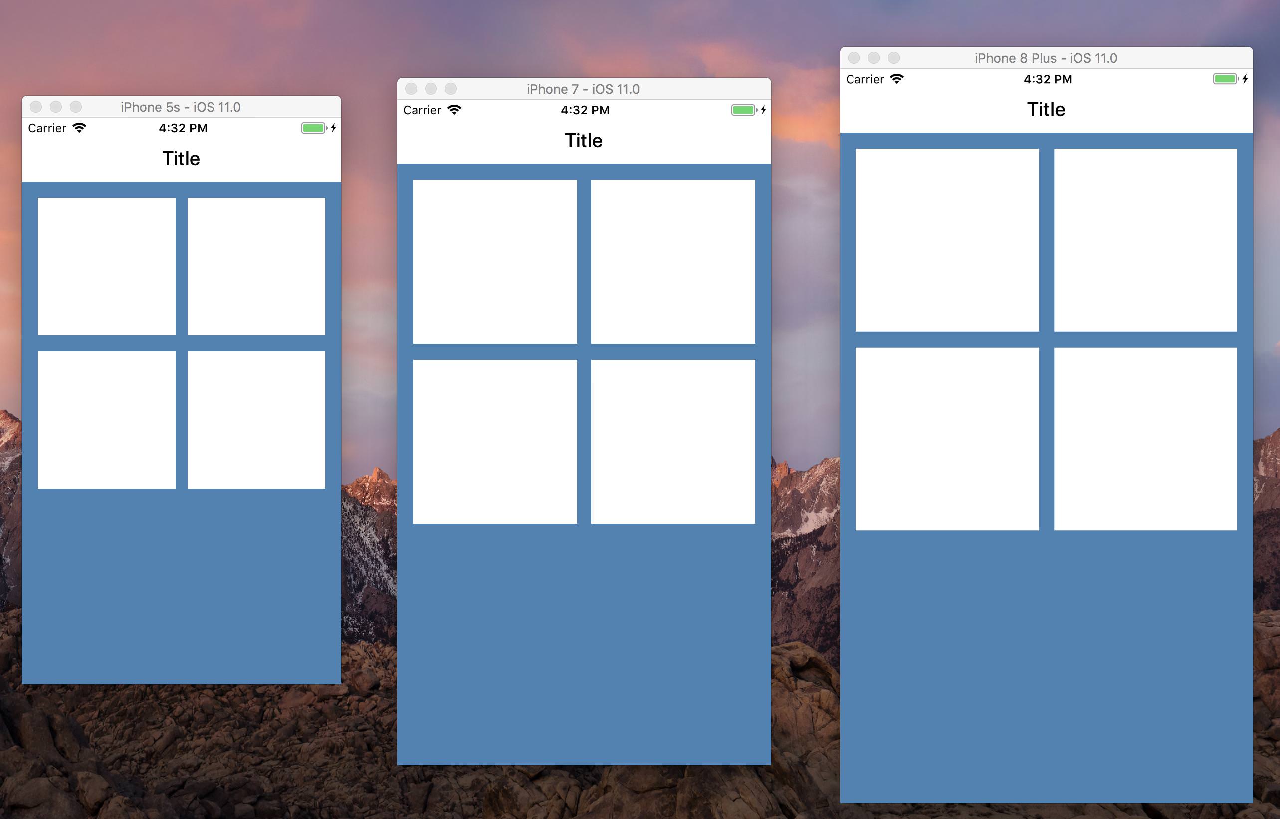
有可能是一個更好的方式與Flexbox的實現這一點,但我通常定義視寬,視高「百分比」助手vwvh,測量的CSS視口大小單位的名字命名:

import {Dimensions} from 'react-native'; 

function vw(percentageWidth) { 
    return Dimensions.get('window').width * (percentageWidth/100); 
} 

function vh(percentageHeight) { 
    return Dimensions.get('window').height * (percentageHeight/100); 
} 

在網格中流動的物品,就可以計算出項目的適當大小,佔利潤和視口大小:

const COLUMNS = 3; 
const MARGIN = vw(1); 
const SPACING = (COLUMNS + 1)/COLUMNS * MARGIN; 

const grid = { 
    flex: 1, 
    flexWrap: 'wrap', 
    flexDirection: 'row', 
    justifyContent: 'flex-start' 
}; 

const cell = { 
    marginLeft: MARGIN, 
    marginTop: MARGIN, 
    width: vw(100)/COLUMNS - SPACING 
} 

return (
    <View style={grid}> 
    {this.props.things.map(thing => <View style={cell} />)} 
    </View> 
) 

時,才應使用這個技術,如果你有一個已知的和LIMITE d數量的項目 - 對於任意數量的卡片,出於性能原因,您應該使用ListView,並將數據集手動分割爲行。

+0

這似乎是迄今爲止最好的解決方案。感謝您分享@jevakallio。 –

+1

這種方法的問題在於,如果允許更改方向,它將不起作用。 – Joon

+0

@Joon correct - 我剛剛發佈了一個庫,可以更方便地在橫向和縱向上對原生組件進行樣式設置:https://github.com/FormidableLabs/react-native-responsive-styles – jevakallio

0

您可以使用justifyContent: '空間' 之間

<View style={styles.feed}> 
    <View style={styles.card} /> 
    <View style={styles.card} /> 
    <View style={styles.card} /> 
    <View style={styles.card} /> 
</View> 

feed: { 
flex: 1, 
flexDirection: 'row', 
flexWrap: 'wrap', 
padding: 16, 
justifyContent: 'space-between' } 


card: { 
backgroundColor: 'white', 
width: '48%', 
aspectRatio: 1, 
marginBottom: 16 } 

screenshot