2017-02-23 47 views
2

所以,我有側邊欄,只是顯示它的一些內容,當它徘徊時,它會顯示所有的側邊欄寬度。如何使css中的過渡橢圓

這是CSS代碼:

.sidenav { 
    height: 100%; 
    width: 100px; 
    position: fixed; 
    z-index: 2; 
    top: 0; 
    left: 0; 
    background-color: #fff; 
    overflow: hidden; 
    padding-top: 20px; 
    transition: 0.8s; 
    -webkit-transition: 0.8s; 
    opacity: 0.8; 
    box-shadow: 0px 20px 50px black; 
} 
.sidenav:hover{ 
    width: 215px; 
    transition: 0.8s; 
    -webkit-transition: 0.8s; 
    overflow: hidden; 
} 

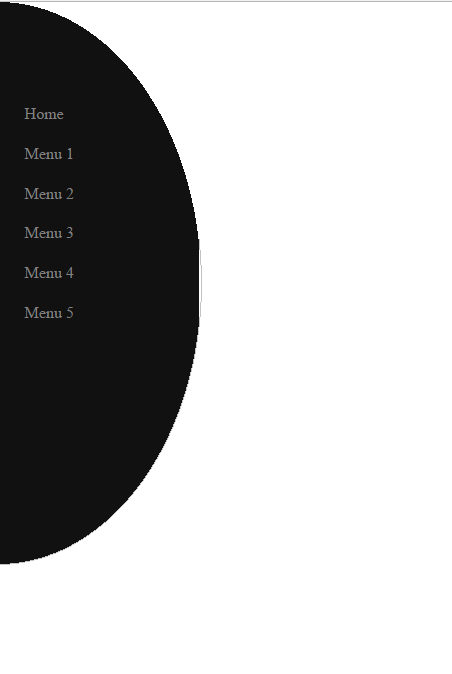
我的問題是如何讓我的側邊欄變成橢圓第一則顯示整個寬度的過渡。感謝
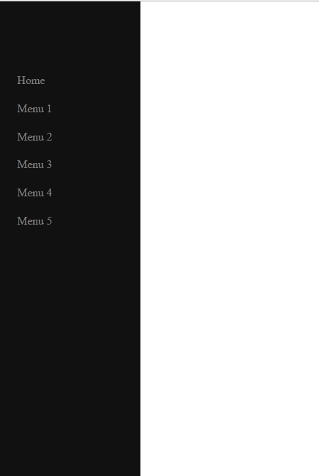
之前是這樣的例證: the initial statefinal statewhat I mean state

+0

在JSfiddle或codepen中發佈您的完整代碼 –

回答

1

你不能只用一個簡單的過渡效果實現這一目標。您將需要使用CSS keyframe animations僅在寬度過渡實現邊界半徑:

.sidenav { 
 
    height: 100%; 
 
    width: 100px; 
 
    position: fixed; 
 
    z-index: 2; 
 
    top: 0; 
 
    left: 0; 
 
    background-color: #fff; 
 
    overflow: hidden; 
 
    padding-top: 20px; 
 
    transition: 0.8s; 
 
    opacity: 0.8; 
 
    box-shadow: 0px 20px 50px black; 
 
    border-radius: 0; 
 
    background: black; 
 
} 


.sidenav:hover { 
 
    width: 215px; 
 
    overflow: hidden; 
 
    animation-name: roundborder; 
 
    animation-duration: 1s; 
 
    animation-iteration-count: 1; 
 
} 


@keyframes roundborder { 
 
    0% { border-radius: 0; } 
 
    50% { border-radius: 0 50% 50% 0; } 
 
    100% { border-radius: 0; } 
 
}
<div class="sidenav"></div>

當然,你需要爲舊版瀏覽器支持正確的供應商前綴。有關更多信息,請參閱border-radius on MDN

+0

我的意思是當寬度從100px變爲215px,但已經215px時恢復正常的過程中,半徑會發生變化 – Rian

+0

好的,更新了我的答案。你需要關鍵幀動畫。 – andreas

+0

嘿,我如何讓邊界凹?可能嗎? – Rian