0
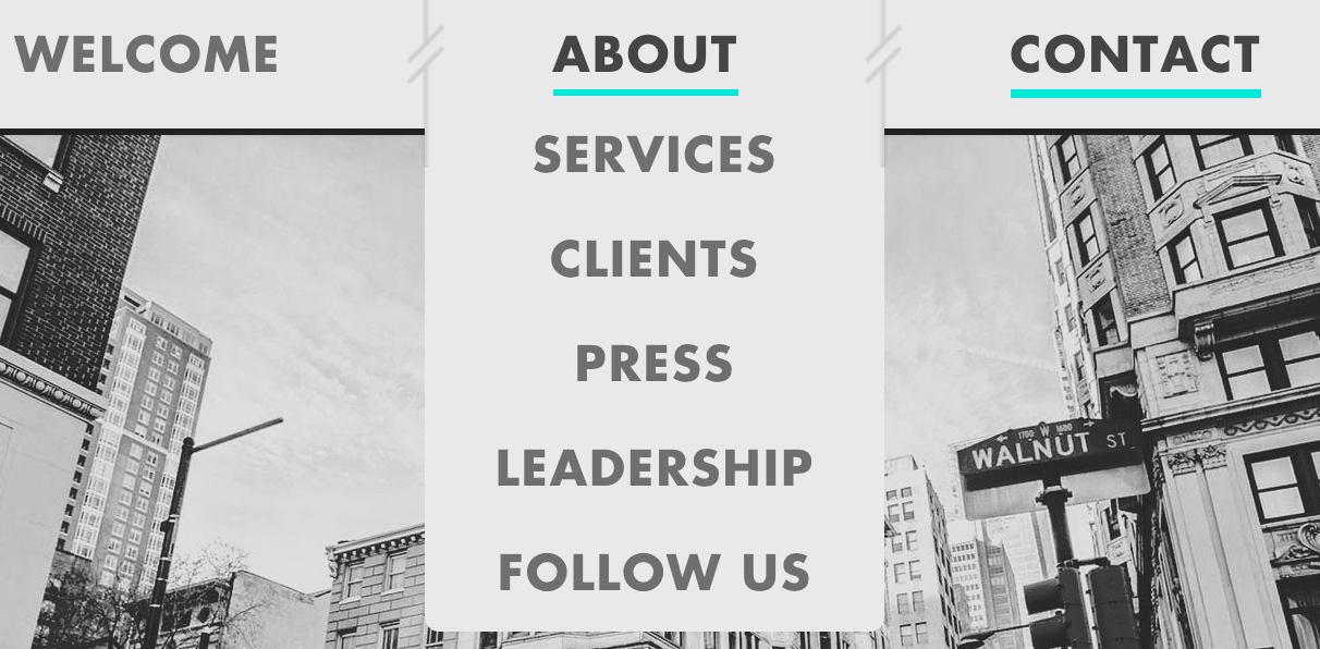
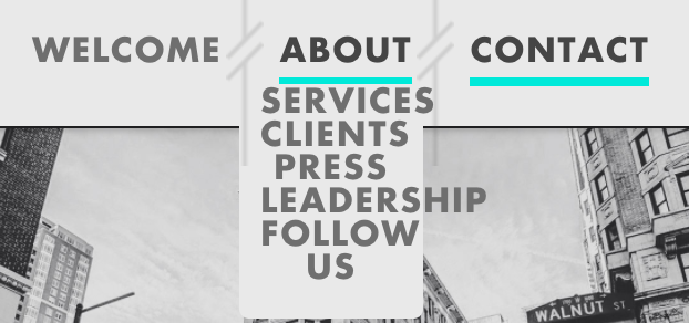
因此,當我運行我的頁面並調整瀏覽器大小/在移動設備上時,下拉菜單變爲未經處理且運行離開頁面時遇到問題。我認爲我必須解決我的填充水平問題,但我不確定我在哪裏,什麼時候得到,比我正在修補的更多。遇到問題保持下拉菜單在調整瀏覽器大小時居中
任何幫助,幫助!
[
$('.drop-down').click(function() {

    \t $(this).hide();

\t });

\t $('.nav-main li').click(function() {

    \t $('.drop-down').hide();

\t });

\t //drop down slide down

\t \t $('.nav-main li ul').hide().removeClass('.drop-down');

\t \t $('.nav-main li').hover(

\t \t \t function openDrop() {

\t \t \t $('ul', this).stop().slideDown(900);

\t \t }, function closeDrop() {

\t \t \t $('ul', this).stop().slideUp(1000);

\t \t });

\t
.nav-main {
\t position: absolute;
\t top: 0;
\t height: 65px;
\t width: 100%;
\t text-align: center;
}
.nav-main ul {
\t position: relative;
\t margin: 0 auto;
\t padding: 0;
\t list-style: none;
\t font-size: 22px;
\t line-height: 100%;
\t font-family: 'Futura W01 Bold', sans-serif;
\t text-align: center;
\t text-transform: uppercase;
\t display: inline-block;
\t width: 100%;
}
.nav-top {
\t position: relative;
\t margin: 0;
\t padding: 0 66px 0 50px;
\t float: none;
\t display: inline-block;
\t list-style: none;
}
.nav-top:first-child {
\t padding-left: 0;
}
.nav-top:last-child {
\t background-image: none;
\t padding-right: 0;
}
.nav-top:last-child:after {
\t content: none;
}
.nav-top > a {
\t position: relative;
\t display: block;
\t margin: 0;
\t color: #6f6f6f;
\t text-decoration: none;
\t padding-top: 20px;
\t padding-bottom: 5px;
\t -moz-transition: all 0.3s ease;
\t -ms-transition: all 0.3s ease;
\t -o-transition: all 0.3s ease;
\t transition: all 0.3s ease;
}
.nav-top a:hover,
.nav-top.active > a {
\t color: #454545;
\t border-bottom: 4px solid #00e9d9;
\t text-decoration: none;
}
.nav-top ul {
display: none;
position: absolute;
left: -8.75px;
width: 105%;
top: calc(100% - 1px);
border-bottom-left-radius: .3em;
border-bottom-right-radius: .3em;
}
.nav-top:hover ul {
position: absolute;
top: calc(100% - 1px);
left: -8.75px;
width: 105%;
}
.nav-top li {
float: center;
background-color: #e9e9e9;
padding-top: 16px;
padding-bottom: 10px;
text-align: inherit;
}
.nav-top li:last-child {
\t padding-bottom: 16px;
\t border-bottom-left-radius: .3em;
border-bottom-right-radius: .3em;
}
.nav-top li > a {
\t position: relative;
\t display: inline;
\t margin: 0;
\t color: #6f6f6f;
\t text-decoration: none;
\t padding-top: 20px;
\t padding-bottom: 1px;
\t -moz-transition: all 0.3s ease;
\t -ms-transition: all 0.3s ease;
\t -o-transition: all 0.3s ease;
\t transition: all 0.3s ease;
}
.nav-top:after {
display: block;
position: absolute;
left: 100%;
top: -17px;
width: 22px;
z-index: 1;
transform: translateX(-50%);
height: 100%;
-ms-transform: translateX(-50%);
-webkit-transform: translateX(-50%);
}<script src="https://ajax.googleapis.com/ajax/libs/jquery/2.1.1/jquery.min.js"></script>
<nav class="nav-main" role="navigation">
\t \t \t \t \t \t <ul>
\t \t \t \t \t \t \t <li class="nav-top"><a href="#welcome">Welcome</a></li>
\t \t \t \t \t \t \t <li class="nav-top"><a href="#about">About</a>
\t \t \t \t \t \t \t \t <ul class="drop-down">
\t \t \t \t \t \t \t \t \t <li class="nav-drop"><a href="#about">Services</a></li>
\t \t \t \t \t \t \t \t \t <li class="nav-drop"><a href="#client">Clients</a></li>
\t \t \t \t \t \t \t \t \t <li class="nav-drop"><a href="#press">Press</a></li>
\t \t \t \t \t \t \t \t \t <li class="nav-drop"><a href="#leadership">Leadership</a></li>
\t \t \t \t \t \t \t \t \t <li class="nav-drop"><a href="#twitter">Follow Us</a></li>
\t \t \t \t \t \t \t \t </ul>
\t \t \t \t \t \t \t </li>
\t \t \t \t \t \t \t <li class="nav-top"><a href="#contact">Contact</a></li>
\t \t \t \t \t \t </ul>
\t \t \t \t \t \t <span class="nav-arrow"></span>
\t \t \t \t \t </nav>] 3
看起來你可能需要一個媒體查詢在某個斷點,以減少你的菜單字體大小 – zgood
如何做到這一點?你能解釋它會做什麼嗎? –