-1
 我試着在圖片上做出html佈局。淺藍色的col-md-2 divs包含圖像,深藍色的col-md-4也是一個圖像。粉紅色的div包含文字。請給出一個簡單的html佈局,它可以完成照片上的內容。以下html佈局可能使用Twitter Bootstrap嗎?
我試着在圖片上做出html佈局。淺藍色的col-md-2 divs包含圖像,深藍色的col-md-4也是一個圖像。粉紅色的div包含文字。請給出一個簡單的html佈局,它可以完成照片上的內容。以下html佈局可能使用Twitter Bootstrap嗎?
是的,它是可能的,但每個「.row」必須有相當於12列這裏面列。所以父列div等於12 col-md-8和col-md-4。但col-md-8 div內的孩子div不等於12.所以那些必須是8和4。或者9和3 ......只要它等於12就可以了。它只取決於內容的內容。你也可以包含div中的所有內容,並將div分配給視圖端口。
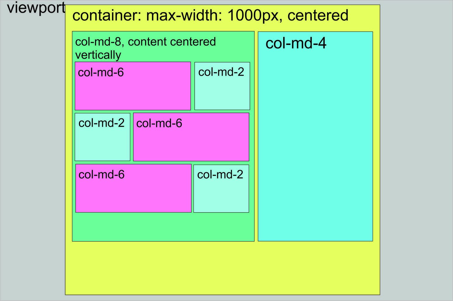
但是這種佈局是可能的。下面我將着重介紹並舉例說明您應該使用的網格系統佈局。
我給列着色了,所以你可以看到網格佈局。希望這可以幫助!
<link href="https://maxcdn.bootstrapcdn.com/bootstrap/3.3.6/css/bootstrap.min.css" rel="stylesheet"/>

<script src="https://maxcdn.bootstrapcdn.com/bootstrap/3.3.6/js/bootstrap.min.js"></script>


<div class='main-container'>

    <div class='row'>

    <div class='col-xs-8' style='Background-color: red; height: 300px;'>

     col-8

     <div class='row'>

     <div class='col-xs-8' style='background-color: blue; height: 80px;'>col8</div>

     <div class='col-xs-4' style='background-color: black; height: 80px;'>col4</div>

     </div>

     <div class='row'>

     <div class='col-xs-4' style='background-color: black; height: 80px;'>col4</div>

     <div class='col-xs-8' style='background-color: blue; height: 80px;'>col8</div>

     </div>

     <div class='row'>

     <div class='col-xs-8' style='background-color: blue; height: 80px;'>col8</div>

     <div class='col-xs-4' style='background-color: black; height: 80px;'>col4</div>

     </div>

    </div>

    <div class='col-xs-4' style='background-color: blue; height: 300px;'>col-4</div>

    </div>

</div>謝謝,這是非常好的。我無法找到的技巧是將.row-s放入大的col-8中,並將col-8中的這些行再次整行處理(將它們分解爲col-8 + col-4)。好想法。謝謝。其餘(對齊和其他小問題)是CSS,沒什麼大不了的。 – Tiha
太棒了!很高興我能幫上忙! –
Twitter Bootstrap中的所有列都是浮動元素。所以你不能只通過Twitter Bootstrap類來獲得內容中心。您可以在塊上嘗試像display: table-cell; vertical-align: middle;這樣的樣式:col-md-8和col-md-4。
當然這是可能的。這裏是一個完全功能例如:
body {

    height: 100%;

    width: 100%;

}

.container {

    width: 1000px;

    max-width: 100%;

    height: 100%;

    background: #E5FF5E;

    padding: 100px 100px 100px 100px !important;

}

.row {

    min-height: 1000px;

    background: red;

}

.vertical {

    display: table-cell;

    vertical-align: middle;

}

.rows {

    height: 200px;

    margin-bottom: 10px;

}

#left-container {

    background: #6AFF98;

    height: 1000px;

    display: table;

}

#right-container {

    background: #6FFFE9;

    height: 1000px;

}

@media (max-width: 767px) {

    #left-container {

    width: 100%;

    }

}

@media (max-width: 991px) and (min-width: 767px) {

    #left-container {

    width: 100%;

    }

}

@media (max-width: 991px) {


}

#r1c1 {

    height: inherit;

    background: #FF76FD;

}

#r1c2 {

    height: inherit;

    background: #A1FFE8;

}
<link href="http://maxcdn.bootstrapcdn.com/bootstrap/3.3.5/css/bootstrap.min.css" rel="stylesheet"/>
<script src="https://ajax.googleapis.com/ajax/libs/jquery/2.1.1/jquery.min.js"></script>
<body>
<div class="container">
<div class="row">
<div id="left-container" class="col-md-8">
<div class="vertical">
<div class="rows">
<div id="r1c1" class="col-md-8"></div>
<div id="r1c2" class="col-md-4"></div>
</div>
<div class="rows">
<div id="r1c1" class="col-md-4"></div>
<div id="r1c2" class="col-md-8"></div>
</div>
<div class="rows">
<div id="r1c1" class="col-md-8"></div>
<div id="r1c2" class="col-md-4"></div>
</div>
</div>
</div>
<div id="right-container" class="col-md-4"></div>
</div>
</div>
</body>非常感謝。我接受了另一個答案,因爲它是第一個,它是純粹的twitter-bootstrap,沒有添加太多的CSS樣式。 (當然需要一些額外的樣式來垂直和水平對齊div,但我更喜歡使用較少的調整並且更多地使用引導樣式)。謝謝。 – Tiha
是,這種佈局是可能的,因爲你已經顯示在你的形象。你有任何你正在努力的代碼嗎?大概是 –
。也許。你爲什麼不試試看,如果遇到問題,那就問一個具體的問題。 –
我有2個小時的嘗試,並停止今天。明天再試一次。對不起,別讓別人爲我做工。 – Tiha