1
我有一些div,其中有一個小的空白或空白。 我已經嘗試更改邊緣頂部和底部,但它不工作。我認爲這與圖像有關,但我還沒有找到解決方案。如何刪除div元素下面的空格
HTML
<!DOCTYPE html>
<html lang = "en-us">
<head>
<title>Vizion Fitness</title>
<link href="https://fonts.googleapis.com/css?family=Roboto:400,500" rel="stylesheet">
<link rel = "stylesheet" type = "text/css" href = "vizion.css">
</head>
<body>
<div class = "clearfix menu">
<a href = "#" class = "logo">Vizion Fitness</a>
<a href = "#contact-title" class = "nav-links last">Contact</a>
<a href = "#portfolio" class = "nav-links">Pricing</a>
<a href = "#skills" class = "nav-links">Trainers</a>
<a href = "#about-me" class = "nav-links ">Home</a>
</div>
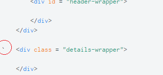
<div id = "header-bg">
<div id = "header-wrapper">
</div>
</div>
` <div class = "details-wrapper">
</div>
</body>
</html>
CSS
body{
    margin: 0;
    padding: 0;
    font-family: 'Roboto', sans-serif;
    font-weight: 400;
    line-height: 1.43;
    color: red;
}

p{
    font-size: 16px;
}

a:link{
    font-size: 16px;
    text-decoration: none;
    margin: 0;
    padding: 0;
}

a:visited{
    text-decoration: none;
    margin: 0;
    padding: 0;
}

h1,h2,h3,h4,h5,h6,ul,ol,li{
    margin: 0;
    padding: 0;

}

ul, ol{
    list-style-type: none;
}

::selection{
    color: #fff;
    background-color: #333;
}

::-moz-selection{
    color: #fff;
    background-color: #333;
}

.clearfix::after{
    content: "";
    display: table;
    clear: both;
}


.menu{
    position:relative;
    background-color: #666666;
    width: 100%;
    height: auto;
    top: 0;
    left: 0;
    z-index: 150;
    margin-bottom: 0;
}

.logo:link{
    float: left;
    font-size: 28px;
    color: white;
    margin-left: 30px;
    margin-top: 20px;
    margin-bottom: 20px;


}

.nav-links:link{
    float: right;
    font-size: 18px;
    color: white;
    margin-right: 20px;
    margin-top: 30px;
    transition: all 0.2s ease;
    -webkit-transition: all 0.2s ease-in-out;
    -moz-transition: all 0.2s ease-in-out;
    -o-transition: all 0.2s ease-in-out;

}

.nav-links:hover{
    color: #ff5b5b;
}

#header-bg{
    position: relative;
    width: 100%;
    height: 590px;
    margin-top: 0;
    background-image: url(bg.jpg);
    background-repeat: no-repeat;
    background-size: cover;
    background-position: center center;
    line-height: 0px;


}

#header-wrapper{
    position: absolute;
    width: 100%;
    height: 100%;
    display: flex;
    flex-flow: row wrap;
    justify-content: center;
    align-items: center;
    flex-direction: column;
    line-height: 0px;

}

/*-----------------------------------------------------DETAILS----------------------------*/

.details-wrapper{
    position: relative;
    width: 100%;
    height: 400px;
    background-color: red;

}
你需要指定你的目標 – Chiller
刪除#頭-BG和.details-包裝之間的空格替換這些div –
究竟是什麼你想達到和位置:絕對/相對和顯示:flex不會放在一起 – Geeky