2017-09-24 54 views
1

我有這個加載SVGSVG - 如何將筆劃從虛線轉爲實心?

enter image description here

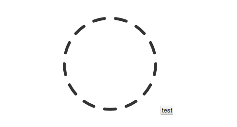
的想法是我的提交表單時,這將顯示,它旋轉。處理完成後,圓應變爲「固定」,您將看到虛線展開併成爲一個整圓,並停止旋轉。

#svg-circle { 
 
    fill: none; 
 
    stroke: #333; 
 
    stroke-width: 6; 
 
    stroke-dasharray: 22.68px; 
 
    stroke-dashoffset: 10px; 
 
    stroke-linecap: round; 
 
    animation: circleAn 1s linear infinite; 
 
    -webkit-transition: ease 250ms; 
 
    -moz-transition: ease 250ms; 
 
    transition: ease 250ms; 
 
} 


@keyframes circleAn { 
 
    to { 
 
    stroke-dashoffset: 100px; 
 
    } 
 
}
<svg id="svg-msg"> 
 
     <circle id="svg-circle" class="svg-circle" cx="100" cy="100" r="94" /> 
 
    </svg>

有什麼建議?

回答

5
stroke-dasharray: 22.68px; 

是以下的縮寫:

stroke-dasharray: 22.68px 22.68px; 

這意味着隨後的22.68的間隙22.68破折號。然後破折號重複。

如果您希望破折號展開,並且相應的間隙縮小,您需要使第一個數字更大,同時第二個數字更小。換句話說,儀表板陣列有可能成爲:

stroke-dasharray: 45.36px 0px; 

$(document).ready(function() { 


    $("#done").on("click", function() { 
 
    $("#svg-circle").css("stroke-dasharray", "45.36px 0px"); 
 
    }) 


})
#svg-msg { 
 
    width: 200px; 
 
    height: 200px; 
 
} 


.svg-circle { 
 
    fill: none; 
 
    stroke: #333; 
 
    stroke-width: 6; 
 
    stroke-dasharray: 22.68px; 
 
    stroke-dashoffset: 10px; 
 
    stroke-linecap: round; 
 
    animation: circleAn 1s linear infinite; 
 
    transition: ease 1s; 
 
} 


.svg-circle-full { 
 
    fill: none; 
 
    stroke: red; 
 
    stroke-width: 6; 
 
    stroke-linecap: round; 
 
} 


@keyframes circleAn { 
 
    to { 
 
    stroke-dashoffset: 100px; 
 
    } 
 
}
<script src="https://ajax.googleapis.com/ajax/libs/jquery/1.11.1/jquery.min.js"></script> 


<svg id="svg-msg"> 
 
    <circle id="svg-circle" class="svg-circle" cx="100" cy="100" r="94" /> 
 
</svg> 
 
<br/> 


<button id="done">Done 
 
</button>

+0

謝謝!一直試圖弄清楚幾個小時。我對svg很陌生,你是如何對它們進行設計的。 – Simon

+0

感謝您提供流暢動畫的指針。 – bhansa

1

事情是這樣的:

$(document).ready(function() { 


    $("#done").on("click", function() { 
 
    $("#svg-circle").css("stroke-dasharray", "44px 0px"); 
 
    }) 


})
.svg-circle { 
 
    fill: none; 
 
    stroke: #333; 
 
    stroke-width: 6; 
 
    stroke-dasharray: 22.68px; 
 
    stroke-dashoffset: 10px; 
 
    stroke-linecap: round; 
 
    animation: circleAn 1s linear infinite; 
 
    -webkit-transition: ease 250ms; 
 
    -moz-transition: ease 250ms; 
 
    transition: ease 250ms; 
 
} 


.svg-circle-full { 
 
    fill: none; 
 
    stroke: red; 
 
    stroke-width: 6; 
 
    stroke-linecap: round; 
 
} 


@keyframes circleAn { 
 
    to { 
 
    stroke-dashoffset: 100px; 
 
    } 
 
}
<script src="https://ajax.googleapis.com/ajax/libs/jquery/1.11.1/jquery.min.js"></script> 
 
<div class="preloader"> 
 
    <svg id="svg-msg"> 
 
    <circle id="svg-circle" class="svg-circle" cx="100" cy="100" r="94" /> 
 
    </svg> 
 
</div> 


<button id="done">Done 
 
</button>

0

動畫相關的SVG特性,即stroke-offset(因爲你已經做了),和stroke-dasharray,像這樣:

// no need for javascript in this example; 
 
// this is just for triggering the additional animation, 
 
// to simulate your form 'submit' action 


var svg = document.getElementById('svg-msg'), 
 
    btn = document.getElementById('swap'); 


btn.addEventListener('click', function(e) { 
 
    svg.classList.remove('rotate'); 
 
    svg.classList.add('merge'); 
 
}, false);
svg { 
 
    height: 200px; 
 
} 


#svg-circle { 
 
    fill: none; 
 
    stroke: #333; 
 
    stroke-width: 6; 
 
    stroke-linecap: round; 
 
    -webkit-transition: 250ms; 
 
    -moz-transition: 250ms; 
 
    transition: 250ms; 
 
} 


svg.rotate #svg-circle { 
 
    stroke-dasharray: 22.68px; 
 
    animation: circleAn 1s linear infinite; 
 
} 


svg.merge #svg-circle { 
 
    animation: circleMerge 1s linear; 
 
} 


@keyframes circleAn { 
 
    from { 
 
    stroke-dashoffset: 10px; 
 
    } 
 
    to { 
 
    stroke-dashoffset: 100px; 
 
    } 
 
} 


@keyframes circleMerge { 
 
    from { 
 
    stroke-dasharray: 22.68px; 
 
    } 
 
    to { 
 
    stroke-dasharray: 22.68px 0; 
 
    } 
 
}
<svg id="svg-msg" class="rotate"> 
 
    <circle id="svg-circle" class="svg-circle" cx="100" cy="100" r="94" /> 
 
</svg> 
 
<button id="swap">swap animation</button>