我會用帆布在列表中,並繪製你的卡到畫布上,因爲在畫布上繪製的東西都不會被裁減,而是通過畫布Z-索引等管理
根據您希望的間距調整畫布大小,並使內容過大。我還建議在使用列表框和使用模板時綁定到Items-source。
順便說一句我正在使用solidColorBrushes定義我的卡片,所以我只能繪製矩形,將其替換爲圖像源。我定義我的源中的資源,但在現實中,它會被綁定到一個ObservableCollection(喂,PlayersCurrentHand或東西):
<UserControl.Resources>
    <x:Array Type="{x:Type SolidColorBrush}" x:Key="Cards">
     <SolidColorBrush Color="Blue"/>
     <SolidColorBrush Color="Red"/>
     <SolidColorBrush Color="White"/>
     <SolidColorBrush Color="White"/>
     <SolidColorBrush Color="White"/>
     <SolidColorBrush Color="White"/>
    </x:Array>
</UserControl.Resources>
現在,我想你正在使用列表框,因爲你要支持選擇?如果是這樣,WPF突出顯示列表框項目的方式將與這種重疊混淆,所以我們需要替換它。如果你不想選擇,只需使用itemsControl,你可以跳過所有選擇的東西。
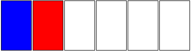
這是我們的基本列表框:
<ListView ItemsSource="{StaticResource Cards}" HorizontalAlignment="Center" VerticalAlignment="Center" Margin="112,98,-325,-25" Width="513" Height="227">
    <ListView.ItemsPanel>
     <ItemsPanelTemplate>
      <StackPanel Orientation="Horizontal" IsItemsHost="True" VerticalAlignment="Top"/>
     </ItemsPanelTemplate>
    </ListView.ItemsPanel>
    <ListView.ItemTemplate>
     <DataTemplate>
      <Border BorderBrush="Black" BorderThickness="1">
       <Rectangle Fill="{Binding}" Width="60" Height="100"/>
      </Border>
     </DataTemplate>
    </ListView.ItemTemplate>
</ListView>
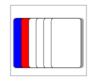
這給了我們這樣的:
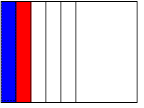
現在,我們希望有一個畫布繪製的所有列表項,那麼讓我們來定義我們的ItemContainerStyle:
<ListView.ItemContainerStyle>
     <Style TargetType="ListViewItem">
      <Setter Property="Template">
       <Setter.Value>
        <ControlTemplate TargetType="{x:Type ListViewItem}">
         <StackPanel>
          <Canvas Width="15" Height="100">
           <ContentPresenter />
          </Canvas>
         </StackPanel>
        </ControlTemplate>
       </Setter.Value>
      </Setter>
     </Style>
    </ListView.ItemContainerStyle>
看看我們如何將畫布寬度設置爲15?這定義了我們卡的間距。所有的畫布以15的間隔堆疊。但是,我們在DateTemplate中繪製的矩形是寬度60,因此這些畫框向右溢出。
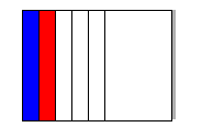
我們已經覆蓋了凌亂的標準選擇和高亮風格。但是,沒有我們不知道什麼是突出和選擇,讓我們添加一些功能回到我們還可以添加一些東西像陰影等。
<ControlTemplate TargetType="{x:Type ListViewItem}">
    <StackPanel>
     <Canvas Width="15" Height="100">
      <Rectangle x:Name="Highlight" Width="60" Height="5" Canvas.Top="105"/>
      <Rectangle Fill="#50000000" Width="60" Height="100" Margin="5,0,-5,0"/>
      <ContentPresenter />
     </Canvas>
    </StackPanel>
    <ControlTemplate.Triggers>
     <Trigger Property="IsSelected" Value="True">
      <Setter TargetName="Highlight" Property="Fill" Value="Yellow"/>
     </Trigger>
     <Trigger Property="IsMouseOver" Value="True">
      <Setter Property="Panel.ZIndex" Value="99"/>
     </Trigger>
    </ControlTemplate.Triggers>
</ControlTemplate>
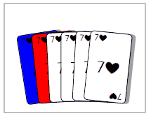
所以現在我們有這樣的:
請注意,gif沒有完全正確地顯示選擇。寬度問題在我認爲沒有一些代碼的情況下修復會很棘手。一種選擇是製作一個IValueConverter,根據卡片列表計算寬度,並將其綁定到Listview的寬度屬性。
編輯
找到一種方法來解決大小問題!填充!當然。然而,我發現滾動瀏覽器的剪輯,甚至它包含畫布(這是有道理的,如果你想想看),但離開我們的所有努力隱藏:
所以,你必須通過設置覆蓋滾動查看器功能手動控件模板:
<ListBox.Template>
     <ControlTemplate>
      <Border Padding="5,25,55,15" BorderBrush="Gray" BorderThickness="1">
       <ItemsPresenter />
      </Border>
     </ControlTemplate>
    </ListBox.Template>
所以現在伸出一個額外的50
總碼,多用一些視覺調整填充佔最後一張牌:
<ListView ItemsSource="{StaticResource Cards}" HorizontalAlignment="Center" VerticalAlignment="Center" Margin="20" BorderBrush="Black">
    <ListBox.Template>
     <ControlTemplate>
      <Border Padding="5,25,55,15" BorderBrush="Gray" BorderThickness="1">
       <ItemsPresenter />
      </Border>
     </ControlTemplate>
    </ListBox.Template>
    <ListView.ItemsPanel>
     <ItemsPanelTemplate>
      <StackPanel Orientation="Horizontal" IsItemsHost="True" ClipToBounds="False" />
     </ItemsPanelTemplate>
    </ListView.ItemsPanel>
    <ListView.ItemContainerStyle>
     <Style TargetType="ListViewItem">
      <Setter Property="Template">
       <Setter.Value>
        <ControlTemplate TargetType="{x:Type ListViewItem}">
         <StackPanel>
          <Canvas Width="15" Height="100">
           <Rectangle x:Name="Highlight" Width="60" Height="5" Canvas.Top="105"/>
           <ContentPresenter x:Name="CardPresenter"/>
          </Canvas>
         </StackPanel>
         <ControlTemplate.Triggers>
          <Trigger Property="IsMouseOver" Value="True">
           <Setter Property="Panel.ZIndex" Value="99"/>
           <Setter TargetName="CardPresenter" Property="Canvas.Top" Value="-5"/>
          </Trigger>
          <Trigger Property="IsSelected" Value="True">
           <Setter TargetName="Highlight" Property="Fill" Value="Yellow"/>
           <Setter TargetName="CardPresenter" Property="Canvas.Top" Value="-20"/>
          </Trigger>
         </ControlTemplate.Triggers>
        </ControlTemplate>
       </Setter.Value>
      </Setter>
     </Style>
    </ListView.ItemContainerStyle>
    <ListView.ItemTemplate>
     <DataTemplate>
      <Grid>
       <Border Background="#60000000" BorderThickness="0" CornerRadius="5" Height="100" Margin="5,0,-5,0"/>
       <Border BorderBrush="Black" BorderThickness="1" CornerRadius="5" Background="{Binding}" Width="60" Height="100"/>
      </Grid>
     </DataTemplate>
    </ListView.ItemTemplate>
</ListView>
它非常靈活,很容易添加「伸出」的功能。動畫將是下一個重大步驟。
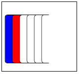
編輯2
我剛纔打。我不確定我喜歡「跳到最前面」的功能,如果他們只是偷看,效果會更好。另外,煽動出來(使用多綁定):
使用下面的模板:
<ControlTemplate TargetType="{x:Type ListViewItem}">
    <StackPanel>
     <Canvas Width="15" Height="100">
      <Rectangle x:Name="Highlight" Width="60" Height="5" Canvas.Top="105"/>
      <ContentPresenter x:Name="CardPresenter">
       <ContentPresenter.RenderTransform>
        <TransformGroup>
         <TranslateTransform x:Name="TranslateTransformHighlight"/>
         <RotateTransform x:Name="RotateTransformHighlight" CenterY="100"/>
         <TranslateTransform x:Name="TranslateTransformSelect"/>
        </TransformGroup>
       </ContentPresenter.RenderTransform>
      </ContentPresenter>
     </Canvas>
    </StackPanel>
    <ControlTemplate.Triggers>
     <Trigger Property="IsMouseOver" Value="True" >
      <Trigger.EnterActions>
       <BeginStoryboard>
        <Storyboard>
         <DoubleAnimation Storyboard.TargetName="TranslateTransformHighlight" Duration="0:0:0.200" To="-5" Storyboard.TargetProperty="Y" />
         <DoubleAnimation Storyboard.TargetName="RotateTransformHighlight" Duration="0:0:0.200" To="-5" Storyboard.TargetProperty="Angle" />
        </Storyboard>
       </BeginStoryboard>
      </Trigger.EnterActions>
      <Trigger.ExitActions>
       <BeginStoryboard>
        <Storyboard>
         <DoubleAnimation Storyboard.TargetName="TranslateTransformHighlight" Duration="0:0:0.200" To="0" Storyboard.TargetProperty="Y" />
         <DoubleAnimation Storyboard.TargetName="RotateTransformHighlight" Duration="0:0:0.200" To="0" Storyboard.TargetProperty="Angle" />
        </Storyboard>
       </BeginStoryboard>
      </Trigger.ExitActions>
     </Trigger>
     <Trigger Property="IsSelected" Value="True">
      <Setter TargetName="Highlight" Property="Fill" Value="Yellow"/>
      <Trigger.EnterActions>
       <BeginStoryboard>
        <Storyboard>
         <DoubleAnimation Storyboard.TargetName="TranslateTransformSelect" Duration="0:0:0.200" To="-15" Storyboard.TargetProperty="Y" />
        </Storyboard>
       </BeginStoryboard>
      </Trigger.EnterActions>
      <Trigger.ExitActions>
       <BeginStoryboard>
        <Storyboard>
         <DoubleAnimation Storyboard.TargetName="TranslateTransformSelect" Duration="0:0:0.200" To="0" Storyboard.TargetProperty="Y" />
        </Storyboard>
       </BeginStoryboard>
      </Trigger.ExitActions>
     </Trigger>
    </ControlTemplate.Triggers>
</ControlTemplate>
使用'StackPanel'和負左或右'margin' – rbr94
當你說「ListView項目的寬度不適合圖像,並且有一定的間距」您是指A卡上的影子還是K卡右側的影子? – ltiveron
是的,我指的是影子 –