6
真的含糊不清的問題,我知道,但我不知道該怎麼形容他們......基本上,我想這些:如何製作方角的東西?
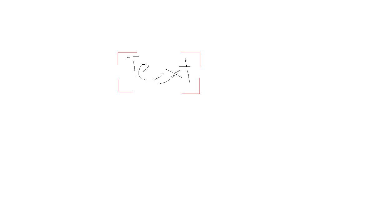
我說的是紅色角落的東西。什麼是最簡單的方法來實現這一點?很顯然,你可以製作出獨特的形狀,但是我想讓他們處於你想要的位置,即使所有的東西都是重新調整大小和形狀,都會是一種痛苦。這是唯一的方法嗎?
真的含糊不清的問題,我知道,但我不知道該怎麼形容他們......基本上,我想這些:如何製作方角的東西?
我說的是紅色角落的東西。什麼是最簡單的方法來實現這一點?很顯然,你可以製作出獨特的形狀,但是我想讓他們處於你想要的位置,即使所有的東西都是重新調整大小和形狀,都會是一種痛苦。這是唯一的方法嗎?
下面的方法可能是有用的。添加兩個僞元素,一個具有頂部和底部邊框,第二個具有特定顏色(白色)的左側和右側邊框,以使它們「白化」原始邊框(在這種情況下爲藍色)。
這種方法是純粹的CSS,不涉及額外的標記。
div {

    font-size: 4.00em;

    padding: 40px;

    border: 2px solid blue;

    display: inline-block;

    position: relative;

}

div:after {

    content: '';

    display: block;

    border-left: 2px solid white;

    border-right: 2px solid white;

    position: absolute;

    height: 50%;

    left: -2px;

    right: -2px;

    top: 25%;

    bottom: 25%;

}

div:before {

    content: '';

    display: block;

    border-top: 2px solid white;

    border-bottom: 2px solid white;

    position: absolute;

    height: 100%;

    left: 25%;

    right: 25%;

    top: -2px;

    bottom: -2px;

}
<div>Box Text</div>好於礦山,1,我應該做的邊界,而不是這當然重疊的文字的背景。 – misterManSam
.a {

    height: 100px;

    width: 100px;

    text-align: center;

    line-height: 100px;

    background-color: #eee;

    position: relative;

    }


.ul {

    position: absolute;

    top: 0;

    left: 0;

    height: 30%;

    width: 30%;

    border-top: 1px solid black;

    border-left: 1px solid black;

    }


.ur {

    position: absolute;

    top: 0;

    right: 0;

    height: 30%;

    width: 30%;

    border-top: 1px solid black;

    border-right: 1px solid black;

    }


.ll {

    position: absolute;

    bottom: 0;

    left: 0;

    height: 30%;

    width: 30%;

    border-bottom: 1px solid black;

    border-left: 1px solid black;

    }


.lr {

    position: absolute;

    bottom: 0;

    right: 0;

    height: 30%;

    width: 30%;

    border-bottom: 1px solid black;

    border-right: 1px solid black;

    }
<div class="a">
<span>text</span>
<div class="ul"></div>
<div class="ur"></div>
<div class="ll"></div>
<div class="lr"></div>
</div>這裏是在評論中提到馬修的border-image解決方案。只是爲了記錄,這裏有很多好的答案。更何況border-image可能不適用於所有瀏覽器。
下面是一個使用內聯SVG中的溶液。
@import url(http://fonts.googleapis.com/css?family=Waiting+for+the+Sunrise);


div {

    width: 275px;

    height: 155px;

    margin: 0 auto;

    font-size: 6.2em;

    text-align: center;

    font-family: 'Waiting for the Sunrise', cursive;

}


.inline-svg {

    border: 5px solid white;

    border-image: url('data:image/svg+xml;utf8,<svg version="1.0" xmlns="http://www.w3.org/2000/svg" xmlns:xlink="http://www.w3.org/1999/xlink" x="0px" y="0px" width="275px" height="155px" viewBox="0 0 275 155" enable-background="new 0 0 275 155" xml:space="preserve"><path fill="#ff0000" d="M0.5,38.5v-38h57v15h-42v23H0.5z M260.5,38.5h15v-38h-59v15h44V38.5z M260.5,112.5v28h-44v15h59v-43H260.5z M15.5,112.5h-15v43h57v-15h-42V112.5z"/></svg>') 2% stretch;

    min-width: 50%;

}


@media screen and (min-width: 992px) {

    .inline-svg {

    width: 360px;

    height: 265px;

    }

    div {

    font-size: 9.4em;

    }

}
<div class="inline-svg">Text</div>
也許嘗試CSS'邊境image' – Matthew