2009-10-07 14 views
472

我試圖在按鈕上有一個圖像(作爲背景)並動態添加,具體取決於運行時發生的情況,圖像上方/上方的某些文本。Android:在Button或ImageButton上組合文本和圖像

如果我使用ImageButton我甚至沒有可能添加文本。 如果我使用Button,我可以添加文本,但只能定義android:drawableBottom和定義爲here的類似XML屬性的圖像。

但是,這些屬性僅將文字&圖像組合在x和y維中,這意味着我可以在我的文本週圍繪製圖像,但不能在我的文本下方/下方繪製圖像(將z軸定義爲從顯示屏出來)。

有關如何做到這一點的任何建議?一種想法是延長ButtonImageButton並覆蓋draw()-方法。但以我目前的知識水平,我並不知道如何去做(2D渲染)。也許有更多經驗的人知道一個解決方案或至少有一些指針要開始?

+0

使用9Patch,智能的解決方案 – AndroSco 2015-07-25 04:41:14

+0

如果你能喜@Charuක請檢查該http://stackoverflow.com/questions/42968587/android-email-client-receiver-email- id-empty-in-android-parse – 2017-03-26 10:26:31

回答

188

您可以撥打setBackgroundDrawable()Button來設置按鈕的背景。

任何文字都會出現在背景上方。

如果您正在尋找類似的XML中有: android:background屬性,它的工作方式相同。

+46

如果你走這條路線,你不想只使用一個簡單的可繪製的背景。使用StateListDrawable(通常通過res/drawable /中的 XML文件),因此您可以爲各種狀態(普通,按下,聚焦,禁用等)定義背景。 – CommonsWare 2009-10-07 18:11:12

+0

同意你,尋找這個問題和我的回答: http://stackoverflow.com/questions/1533038/android-specify-two-different-images-for-togglebutton-using-xml – 2009-10-07 18:40:21

+1

多麼愚蠢。我怎麼能錯過在文檔中。感謝您的快速回答,並提供的提示。這是我一定會在未來實施的。 – znq 2009-10-08 09:20:25

552

對於誰只想把背景,圖標,圖像和文本在一個Button從不同的文件用戶:設置在Button背景,drawableTop /下/分辯/左和填充屬性。

<Button 
     android:layout_width="wrap_content" 
     android:layout_height="wrap_content" 
     android:background="@drawable/home_btn_test" 
     android:drawableTop="@drawable/home_icon_test" 
     android:textColor="#FFFFFF" 
     android:id="@+id/ButtonTest" 
     android:paddingTop="32sp" 
     android:drawablePadding="-15sp" 
     android:text="this is text"></Button> 

對於更復雜的安排,您也可以使用RelativeLayout並使其可點擊。

教程:偉大的教程,涵蓋這兩種情況下:http://izvornikod.com/Blog/tabid/82/EntryId/8/Creating-Android-button-with-image-and-text-using-relative-layout.aspx

+65

以編程方式使用'b.setCompoundDrawablesWithIntrinsicBound(null,R.drawable.home_icon_test,null,null)'而不是'android:drawableTop'和'b.setPadding(0,32,0, 0)'而不是'android:paddingTop'。 – 2010-11-30 02:19:14

+3

將佈局用作按鈕實際上是一種非常靈活的方法。 – sstn 2011-05-27 14:05:47

+1

只需將0替換爲null如果您使用資源ID爲您的繪圖 – Ran 2013-05-28 08:00:14

303

有針對此問題更好的解決方案。

只需採取正常的Button並使用drawableLeftgravity屬性。

<Button 
    android:layout_width="fill_parent" 
    android:layout_height="wrap_content" 
    android:drawableLeft="@drawable/my_btn_icon" 
    android:gravity="left|center_vertical" /> 

這樣,你得到它顯示在按鈕的左側的圖標,在圖標垂直居中的正確的網站的文本的按鈕。

+2

如果您選擇在按鈕上有背景色(在這種情況下很可能),則此解決方案會出現問題。然後將不會有點擊或選擇的圖形響應。你可以編寫一個選擇器來處理這個,但是你不會得到手機的默認顏色。 – Vanja 2011-07-14 16:21:27

+8

只是想補充一點,如果使用此解決方案,_Drawable padding_屬性非常有用。 – 2012-02-16 14:42:42

+4

有沒有辦法在xml中設置繪製圖標的高度和寬度? – penguru 2012-04-13 11:03:40

39

只需更換

​​

android:background="@android:color/transparent" 
android:drawableTop="@drawable/[your background image here]" 

伊茨一個相當不錯的招..;)

20

我從這裏所說的那些不同的方法,它是真正的工作好吧,所以我想分享它。

我正在使用樣式創建一個自定義按鈕,圖像位於左側,文本位於中右側。只需按照以下4個「簡單步驟」進行操作:

I.使用至少3個不同的PNG文件和您擁有的工具創建9個修補程序:/YOUR_OWN_PATH/android-sdk-mac_x86/tools/./draw9patch。在這之後,你應該有:

button_normal.9.png,button_focused.9.png和button_pressed.9.png

然後下載或創建一個24x24的PNG圖標。

ic_your_icon.png

保存所有在你的Android項目的繪製/文件夾。

二,在drawable /文件夾下的項目中創建一個名爲button_selector.xml的XML文件。國家應該是這樣的:

<item android:state_pressed="true" android:drawable="@drawable/button_pressed" /> 
<item android:state_focused="true" android:drawable="@drawable/button_focused" /> 
<item android:drawable="@drawable/button_normal" /> 

三,轉至值/文件夾並打開或創建styles.xml文件,並創建以下XML代碼:

<style name="ButtonNormalText" parent="@android:style/Widget.Button"> 
    <item name="android:textColor" >@color/black</item> 
    <item name="android:textSize" >12dip</item> 
    <item name="android:textStyle" >bold</item> 
    <item name="android:height" >44dip</item> 
    <item name="android:background" >@drawable/button_selector</item> 
    <item name="android:focusable" >true</item> 
    <item name="android:clickable" >true</item> 
</style> 

<style name="ButtonNormalTextWithIcon" parent="ButtonNormalText"> 
    <item name="android:drawableLeft" >@drawable/ic_your_icon</item> 
</style> 

ButtonNormalTextWithIcon是「子風格」,因爲它正在擴大ButtonNormalText(以下簡稱「父樣式」)。

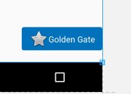
請注意,將ButtonNormalTextWithIcon樣式中的drawableLeft更改爲drawableRight,drawableTop或drawableBottom,可以將該圖標放置在與文本相關的其他位置。四,參考文獻轉至佈局/文件夾,你有你的XML的用戶界面,並轉到要應用的風格,使它看起來像這樣的按鈕:

<Button android:id="@+id/buttonSubmit" 
android:text="@string/button_submit" 
android:layout_width="fill_parent" 
android:layout_height="wrap_content" 
style="@style/ButtonNormalTextWithIcon" ></Button> 

而且......瞧!你在左側拿到了一個圖片。

對我來說,這是更好的方式來做到這一點!因爲按照這種方式進行操作,您可以根據要顯示的圖標單獨管理按鈕的文本大小,並根據Android UI準則使用樣式爲具有不同圖標的多個按鈕使用相同的背景可繪製。

您還可以爲您的應用程序創建一個主題,併爲其添加「父風格」,以便所有按鈕看起來都一樣,並將「子風格」與圖標一起應用到您需要的地方。

+0

好的工作。我在裏面使用了一個ImageView和TextView的FrameLayout視圖方法,但是這種方法更好。 – pilcrowpipe 2013-01-27 00:43:42

+0

令人敬畏的做法。 facebook SDK(版本3)採用與登錄按鈕相同的方法 – 2013-06-20 19:29:36

12
<Button android:id="@+id/imeageTextBtn" 
     android:layout_width="240dip" 
     android:layout_height="wrap_content" 
     android:text="Side Icon With Text Button" 
     android:textSize="20sp" 
     android:drawableLeft="@drawable/left_side_icon"   
     /> 
45

只需使用一個的LinearLayout,假裝這是一個Button - 設置background點擊是關鍵:

<LinearLayout 
    android:id="@+id/button" 
    android:layout_width="wrap_content" 
    android:layout_height="wrap_content" 
    android:background="@android:drawable/btn_default" 
    android:clickable="true" 
    android:orientation="horizontal" > 

    <ImageView 
     android:id="@+id/img" 
     android:layout_width="wrap_content" 
     android:layout_height="wrap_content" 
     android:layout_gravity="center_vertical" 
     android:layout_marginLeft="5dp" 
     android:src="@drawable/image" /> 

    <TextView 
     android:id="@+id/textView2" 
     android:layout_width="wrap_content" 
     android:layout_height="wrap_content" 
     android:layout_gravity="center_vertical" 
     android:layout_margin="5dp" 
     android:text="Do stuff" /> 
</LinearLayout> 
+1

如何添加點擊效果? – frankish 2013-02-26 14:55:56

+3

最佳答案,這種方式可以管理100%的外觀和感覺,而且不必將圖標粘貼到邊框上。 – Climbatize 2013-12-16 15:54:03

+0

frankish,將'android:onClick'添加到您的視圖 – 2016-03-04 00:39:32

0

您可以使用此:

<Button 
        android:id="@+id/reset_all" 
        android:layout_width="wrap_content" 
        android:layout_height="wrap_content" 
        android:layout_marginRight="5dp" 
        android:layout_weight="1" 
        android:background="@drawable/btn_med" 
        android:text="Reset all" 
        android:textColor="#ffffff" /> 

       <Button 
        android:id="@+id/undo" 
        android:layout_width="wrap_content" 
        android:layout_height="wrap_content" 
        android:layout_marginLeft="5dp" 
        android:layout_weight="1" 
        android:background="@drawable/btn_med" 
        android:text="Undo" 
        android:textColor="#ffffff" /> 

因爲我已經把圖像作爲background,並且還添加了文本..!

10

您可以通過添加gravityleft|center_vertical

<Button 
      android:id="@+id/btn_video" 
      android:layout_width="wrap_content" 
      android:layout_height="wrap_content" 
      android:layout_alignParentRight="true" 
      android:layout_centerVertical="true" 
      android:background="@null" 
      android:drawableTop="@drawable/videos" 
      android:gravity="left|center_vertical" 
      android:onClick="onClickFragment" 
      android:text="Videos" 
      android:textColor="@color/white" /> 
5

該代碼使用的圖像drawableTop(也drawableLeft等),並設置文本,圖像下方完美的作品對我來說

<LinearLayout 
    android:id="@+id/choosePhotosView" 
    android:layout_width="match_parent" 
    android:layout_height="wrap_content" 
    android:orientation="horizontal" 
    android:gravity="center" 
    android:clickable="true" 
    android:background="@drawable/transparent_button_bg_rev_selector"> 

    <ImageView 
     android:layout_width="wrap_content" 
     android:layout_height="wrap_content" 
     android:src="@drawable/choose_photo"/> 

    <TextView 
     android:layout_width="wrap_content" 
     android:layout_height="wrap_content" 
     android:textColor="@android:color/white" 
     android:text="@string/choose_photos_tv"/> 

</LinearLayout> 
+0

我試過了您的代碼..它可以正常工作,但是您的代碼的主要問題是如果您有一組按鈕,並且每個按鈕中都有不同的文本大小。你的佈局將被移位。因此,按鈕的每個圖片位置將處於不同的位置。雖然它應該是中心的直線。 這是按鈕發生的情況。 – 2017-02-24 10:07:04

55

enter image description here

 <Button 
      android:layout_width="0dp" 
      android:layout_weight="1" 
      android:background="@drawable/home_button" 
      android:drawableLeft="@android:drawable/ic_menu_edit" 
      android:drawablePadding="6dp" 
      android:gravity="left|center" 
      android:height="60dp" 
      android:padding="6dp" 
      android:text="AndroidDhina" 
      android:textColor="#000" 
      android:textStyle="bold" /> 
+0

這是短而高效的使用。謝謝。 – Ahmed 2016-02-19 17:29:02

+3

一個簡單而錯誤的解決方案。僅用於左對齊。 – CoolMind 2016-08-15 13:41:32

+2

@ CoolMind我解釋只爲上面的圖像我已附加..如果你想正確對齊使用drawableRight – 2016-08-16 04:57:05

6

也許我的解決方案適合很多用戶,我希望如此。

我在暗示它是用你的風格製作TextView的。它完美地適用於我,並具有所有功能,如按鈕。

首先讓做的按鈕樣式,你可以用它無處不在......我創建button_with_hover.xml

<?xml version="1.0" encoding="utf-8"?> 
<selector xmlns:android="http://schemas.android.com/apk/res/android"> 
    <item android:state_pressed="true" > 
     <shape android:shape="rectangle" > 
      <corners android:radius="3dip" /> 
      <stroke android:width="1dip" android:color="#8dbab3" /> 
      <gradient android:angle="-90" android:startColor="#48608F" android:endColor="#48608F" /> 
     </shape> 

     <!--#284682;--> 
     <!--border-color: #223b6f;--> 
    </item> 
    <item android:state_focused="true"> 
     <shape android:shape="rectangle" > 
      <corners android:radius="3dip" /> 
      <stroke android:width="1dip" android:color="#284682" /> 
      <solid android:color="#284682"/> 
     </shape> 
    </item> 
    <item > 
     <shape android:shape="rectangle" > 
      <corners android:radius="3dip" /> 
      <stroke android:width="1dip" android:color="@color/ControlColors" /> 
      <gradient android:angle="-90" android:startColor="@color/ControlColors" android:endColor="@color/ControlColors" /> 
     </shape> 
    </item> 

</selector> 

其次, 讓我們創建一個TextView按鈕。

<TextView 
    android:layout_width="wrap_content" 
    android:layout_height="wrap_content" 
    android:layout_marginBottom="20dip" 
    android:layout_gravity="right|bottom" 
    android:gravity="center" 
    android:padding="12dip" 
    android:background="@drawable/button_with_hover" 
    android:clickable="true" 
    android:drawableLeft="@android:drawable/btn_star_big_off" 
    android:textColor="#ffffffff" 
    android:text="Golden Gate" /> 

這就是結果。然後使用任何顏色或任何其他屬性和邊距設置您的自定義按鈕。祝你好運

enter image description here

+0

雖然我還沒有測試你的代碼作爲方法似乎是正確的,但我不明白有懸停效應的原因在移動應用程序中。 – 2018-01-30 09:59:52

+0

我已經爲我的應用創建了懸停效果,並且在該應用生成過程中我需要懸停效果。但這取決於你:)如果沒有必要,你可以刪除懸停效果。 – 2018-01-30 10:12:04

+0

我已經投票了你的答案,因爲這是一個非常好的方法。我唯一的一點是在移動界面上,你怎麼能徘徊? – 2018-01-30 10:13:18

-1
<ImageView 
     android:id="@+id/iv" 
     android:layout_width="match_parent" 
     android:layout_height="match_parent" 
     android:scaleType="centerCrop" 
     android:src="@drawable/temp" 
     /> 
相關問題