2016-12-30 54 views
4

這裏是我的代碼片段:如何將兩個div放在垂直排序的flex div的一行中?

.container { 
 
    display: flex; 
 
    flex-direction: column; 
 
} 
 
.container > div { 
 
    padding: 20px; 
 
    color: #fff; 
 
    margin: 5px; 
 
    text-align: center; 
 
    font-size: 30px; 
 
} 
 
.fruits { 
 
    order: 2; 
 
    background: #ff5423; 
 
} 
 
.container :not(.fruits) { 
 
    order: 1; 
 
} 
 
.flowers { 
 
    background: #f970bd; 
 
} 
 
.trees { 
 
    background: #049500; 
 
}
<div class="container"> 
 
    <div class="fruits">The fruits</div> 
 
    <div class="flowers">The flowers</div> 
 
    <div class="fruits">The fruits</div> 
 
    <div class="trees">The trees</div> 
 
    <div class="fruits">The fruits</div> 
 
</div>

我把所有.fruits格在底部使用flex-direction: column;。還有另外兩個div .flowers.trees,它們可以隨機放置在.conatiner的任何地方,我無法處理。我希望它們佔據其父寬度的一半,因此它們只佔用一行。

我想要什麼來實現的: enter image description here

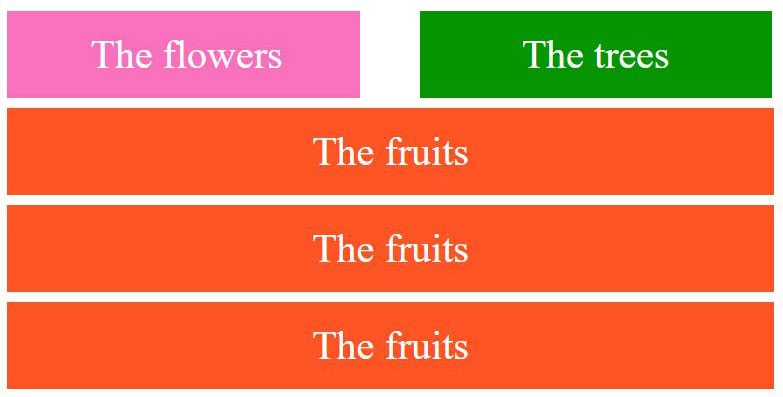
給予50%的寬度不會在這裏工作。我知道規則說明了方向是列式的,但是,我仍然希望如果有任何可用的方法/技巧這樣做!使用不同技術而不是使用flex的任何其他解決方法也將有所幫助。

回答

7

你可以用flex-direction: row做到這一點,你只需要在父母上設置flex-wrap: wrap,在你想要半寬的元素上設置flex: 0 0 50%

您還需要使用* {box-sizing: border-box}用於填充,而calc()用於頁邊距。

* { 
 
    box-sizing: border-box; 
 
} 
 
.container { 
 
    display: flex; 
 
    flex-wrap: wrap; 
 
} 
 
.container > div { 
 
    padding: 20px; 
 
    color: #fff; 
 
    margin: 5px; 
 
    flex: 0 0 calc(100% - 10px); 
 
    text-align: center; 
 
    font-size: 30px; 
 
} 
 
.fruits { 
 
    order: 2; 
 
    background: #ff5423; 
 
} 
 
.container div:not(.fruits) { 
 
    order: 1; 
 
    flex: 0 0 calc(50% - 10px); 
 
} 
 
.flowers { 
 
    background: #f970bd; 
 
} 
 
.trees { 
 
    background: #049500; 
 
}
<div class="container"> 
 
    <div class="fruits">The fruits</div> 
 
    <div class="flowers">The flowers</div> 
 
    <div class="fruits">The fruits</div> 
 
    <div class="trees">The trees</div> 
 
    <div class="fruits">The fruits</div> 
 
</div>

+0

真棒!你搖滾! :) –