2017-05-19 56 views
0

我發現下面的鏈接...但它仍然沒有幫助我...Flexbox的100%的高度問題

how to make nested flexboxes work
Height 100% on flexbox column child
How to make flexbox children 100% height of their parent?

我需要一個完整的頁面,是如下圖所示: full page 
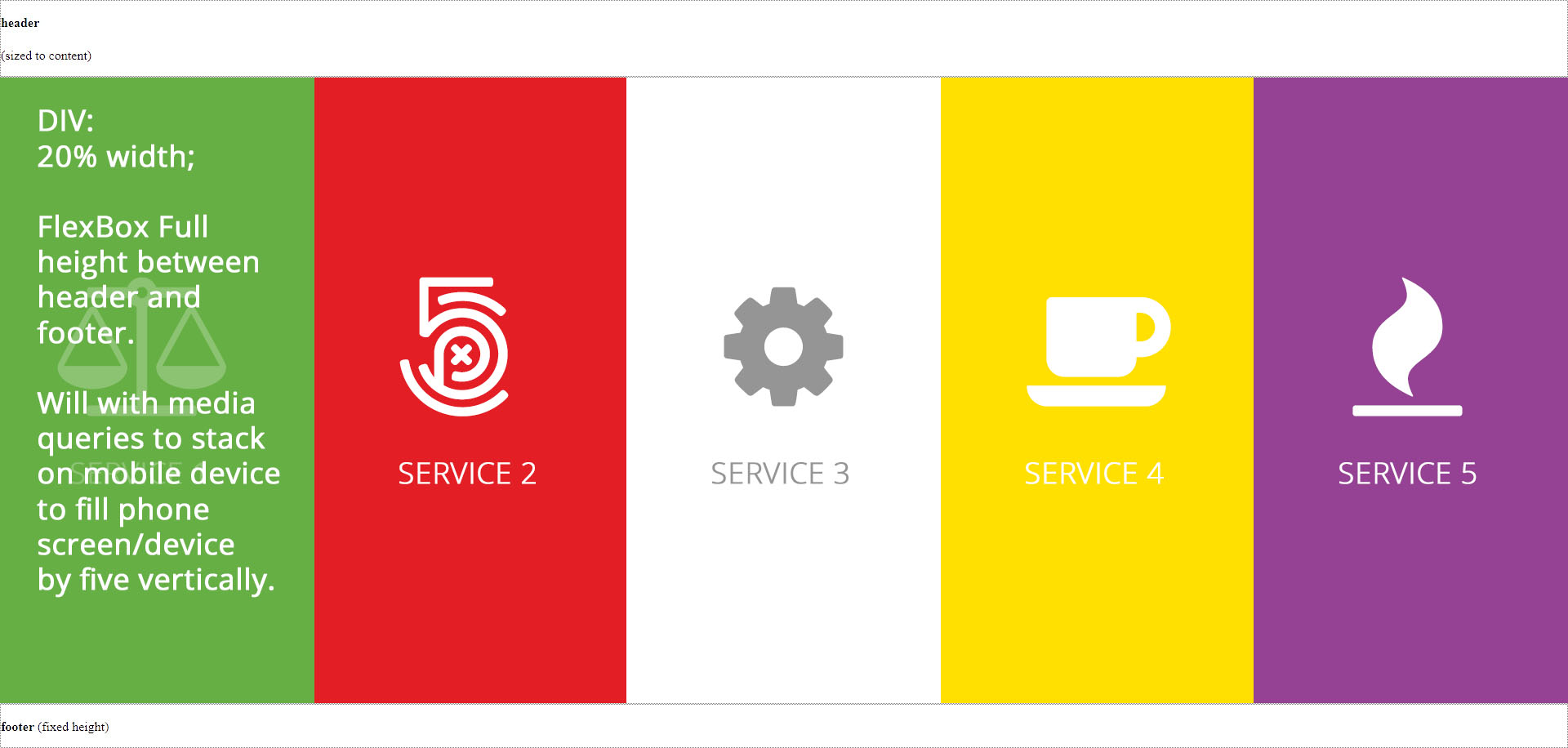
使用頁眉和頁腳以及中間5列在其餘空間中平均填充高度,然後在執行媒體查詢時,填充移動設備的屏幕,如下所示:

mobile view

這裏是我到目前爲止的代碼...

<!DOCTYPE html PUBLIC "-//W3C//DTD XHTML 1.0 Transitional//EN" "http://www.w3.org/TR/xhtml1/DTD/xhtml1-transitional.dtd"> 
<html xmlns="http://www.w3.org/1999/xhtml"> 
<head> 
<meta http-equiv="Content-Type" content="text/html; charset=utf-8" /> 
<title>Untitled Document</title> 
<style type="text/css"> 
html, 
body { 
    height: 100%; 
    margin: 0 
} 

.box { 
    display: flex; 
    flex-flow: column; 
    height: 100%; 
} 

.box .row { 
    border: 1px dotted grey; 
} 

.box .row.header { 
    flex: 0 1 auto; 
    /* The above is shorthand for: 
    flex-grow: 0, 
    flex-shrink: 1, 
    flex-basis: auto 
    */ 
} 

.box .row.content { 
    flex: 1 1 auto; 
} 

.box .row.footer { 
    flex: 0 1 40px; 
} 

.yellow-back { 
    background: #ffe001; 
} 

.red-back { 
    background: #e31e25; 
} 

.green-back { 
    background: #66af45; 
} 

.purple-back { 
    background: #954294; 
} 

.containerFull         { position: relative; width: 100%; margin: 0 auto; padding: 0;} 
.containerFull .column, 
.containerFull .columns       { float: left; display: inline; margin-left: 0px; margin-right: 0px; } 
.containerFull .one-fifth.column    { width: 20%; } 
</style> 
</head> 

<body> 

<div class="box"> 

    <div class="row header"> 
    <p><b>header</b> 
     <br /> 
     <br />(sized to content)</p> 
    </div> 

    <div class="row content"> 

     <div class="containerFull">  
      <div class="one-fifth column green-back">Here</div> 
      <div class="one-fifth column red-back">Here</div> 
      <div class="one-fifth column">Here</div> 
      <div class="one-fifth column yellow-back">Here</div> 
      <div class="one-fifth column purple-back">Here</div> 
     </div><!-- ContainerFull --> 

    </div> 

    <div class="row footer"> 
    <p><b>footer</b> (fixed height)</p> 
    </div> 
</div> 

</body> 
</html> 

html, 
 
body { 
 
    height: 100%; 
 
    margin: 0 
 
} 


.box { 
 
    display: flex; 
 
    flex-flow: column; 
 
    height: 100%; 
 
} 


.box .row { 
 
    border: 1px dotted grey; 
 
} 


.box .row.header { 
 
    flex: 0 1 auto; 
 
    /* The above is shorthand for: 
 
     flex-grow: 0, 
 
     flex-shrink: 1, 
 
     flex-basis: auto 
 
     */ 
 
} 


.box .row.content { 
 
    flex: 1 1 auto; 
 
} 


.box .row.footer { 
 
    flex: 0 1 40px; 
 
} 


.yellow-back { 
 
    background: #ffe001; 
 
} 


.red-back { 
 
    background: #e31e25; 
 
} 


.green-back { 
 
    background: #66af45; 
 
} 


.purple-back { 
 
    background: #954294; 
 
} 


.containerFull { 
 
    position: relative; 
 
    width: 100%; 
 
    margin: 0 auto; 
 
    padding: 0; 
 
} 


.containerFull .column, 
 
.containerFull .columns { 
 
    float: left; 
 
    display: inline; 
 
    margin-left: 0px; 
 
    margin-right: 0px; 
 
} 


.containerFull .one-fifth.column { 
 
    width: 20%; 
 
}
<div class="box"> 


    <div class="row header"> 
 
    <p><b>header</b> 
 
     <br /> 
 
     <br />(sized to content)</p> 
 
    </div> 


    <div class="row content"> 


    <div class="containerFull"> 
 
     <div class="one-fifth column green-back">Here</div> 
 
     <div class="one-fifth column red-back">Here</div> 
 
     <div class="one-fifth column">Here</div> 
 
     <div class="one-fifth column yellow-back">Here</div> 
 
     <div class="one-fifth column purple-back">Here</div> 
 
    </div> 
 
    <!-- ContainerFull --> 


    </div> 


    <div class="row footer"> 
 
    <p><b>footer</b> (fixed height)</p> 
 
    </div> 
 
</div>

+0

我忘了補充一點,我想要的背景圖像或顏色填充空間...謝謝! –

+0

也許這個職位可以幫助你。 [div內的內容不會填充可用空間而不指定高度](http://stackoverflow.com/questions/43922077/content-within-div-wont-fill-available-space-without-specifying-height/43922584#43922584 ),檢查你是否將身體的高度設置爲100vh,然後將其餘的內容高度設置爲更容易。還使用CSS重置文件,以避免奇怪的行爲。 –

回答

2

除了邁克爾·科克爾的答案,如果你去一路與flexbox,這可以減少你都標記和CSS相當多,得到這個驚人的結果。

我還收錄了您評論/詢問的背景圖片和媒體查詢,只是爲了說明這可以做得多簡單。

在CSS中做了一些筆記。當涉及到頁眉和頁腳時,如果你願意,你可以給它們一個高度,但這不起作用,所以我把它們排除了,這樣就可以看到Flexbox在分發內容方面的表現如何......希望我有該技術在20年前:)

html, body { 
 
    margin: 0; 
 
} 
 
.box { 
 
    display: flex; 
 
    flex-direction: column; 
 
    height: 100vh;   /* instead of using 100% all over, use viewport units once */ 
 
    background-size: cover; 
 
    background: black url(http://lorempixel.com/500/500/nature/4/) no-repeat center; 
 
} 
 
.box .row.content, 
 
.content .one-fifth.column { 
 
    flex: 1;    /* fill the space equal, no matter row or column direction */ 
 
    display: flex; 
 
} 


.box .row.header, 
 
.box .row.footer { color: white; } 
 
.box .row.content { background: #fff; } 
 
.yellow-back { background: #ffe001; } 
 
.red-back { background: #e31e25; } 
 
.green-back { background: #66af45; } 
 
.purple-back { background: #954294; } 


@media screen and (max-width: 600px) { 
 
    /* smaller screens */ 
 
    .box .row.content { 
 
    flex-direction: column; /* by simply swap direction it work on smaller screen */ 
 
    } 
 
}
<div class="box"> 
 
    <div class="row header"> 
 
    <p><b>header</b><br /><br />(sized to content)</p> 
 
    </div> 


    <div class="row content"> 
 
    <div class="one-fifth column green-back">Here</div> 
 
    <div class="one-fifth column red-back">Here</div> 
 
    <div class="one-fifth column">Here</div> 
 
    <div class="one-fifth column yellow-back">Here</div> 
 
    <div class="one-fifth column purple-back">Here</div> 
 
    </div> 


    <div class="row footer"> 
 
    <p><b>footer</b> (fixed height)</p> 
 
    </div> 
 
</div>

+1

很好的答案,少代碼總是更好! –

+0

@lgson這很棒,就像一個魅力!現在...我需要的只是圖標(PNG)和下面的標題,以便保留在柔性高度框的中間,然後在移動設備上時,圖標必須左移,標題右移的圖標。 DO-能? –

+0

@JPGreeff這個你喜歡的這個? ... https://jsfiddle.net/00yok8gt/ – LGSon

2

我會讓柱截面柔性佈局了。您可以將.content.containerFull設置爲display: flex,然後.containerFull將「拉伸」至填充.content的高度,然後您可以在列上使用flex-basis來控制寬度。

html, 
 
body { 
 
    height: 100%; 
 
    margin: 0 
 
} 


.box { 
 
    display: flex; 
 
    flex-flow: column; 
 
    height: 100%; 
 
} 


.box .row { 
 
    border: 1px dotted grey; 
 
} 


.box .row.header { 
 
    flex: 0 1 auto; 
 
    /* The above is shorthand for: 
 
    flex-grow: 0, 
 
    flex-shrink: 1, 
 
    flex-basis: auto 
 
    */ 
 
} 


.box .row.content { 
 
    display: flex; 
 
} 


.box .row.content { 
 
    flex: 1 1 auto; 
 
} 


.containerFull { 
 
    display: flex; 
 
} 


.box .row.footer { 
 
    flex: 0 1 40px; 
 
} 


.yellow-back { 
 
    background: #ffe001; 
 
} 


.red-back { 
 
    background: #e31e25; 
 
} 


.green-back { 
 
    background: #66af45; 
 
} 


.purple-back { 
 
    background: #954294; 
 
} 


.containerFull { 
 
    position: relative; 
 
    width: 100%; 
 
    margin: 0 auto; 
 
    padding: 0; 
 
} 


.containerFull .column, 
 
.containerFull .columns { 
 
    margin-left: 0px; 
 
    margin-right: 0px; 
 
} 


.containerFull .one-fifth.column { 
 
    flex-basis: 20%; 
 
}
<div class="box"> 


    <div class="row header"> 
 
    <p><b>header</b> 
 
     <br /> 
 
     <br />(sized to content)</p> 
 
    </div> 


    <div class="row content"> 


     <div class="containerFull">  
 
      <div class="one-fifth column green-back">Here</div> 
 
      <div class="one-fifth column red-back">Here</div> 
 
      <div class="one-fifth column">Here</div> 
 
      <div class="one-fifth column yellow-back">Here</div> 
 
      <div class="one-fifth column purple-back">Here</div> 
 
     </div><!-- ContainerFull --> 


    </div> 


    <div class="row footer"> 
 
    <p><b>footer</b> (fixed height)</p> 
 
    </div> 
 
</div>

+0

Upvoted你的,我只是張貼了我自己的答案,因爲這是一個經典的問題,其中flexbox的確很好,只有極少的代碼和標記:) – LGSon