1
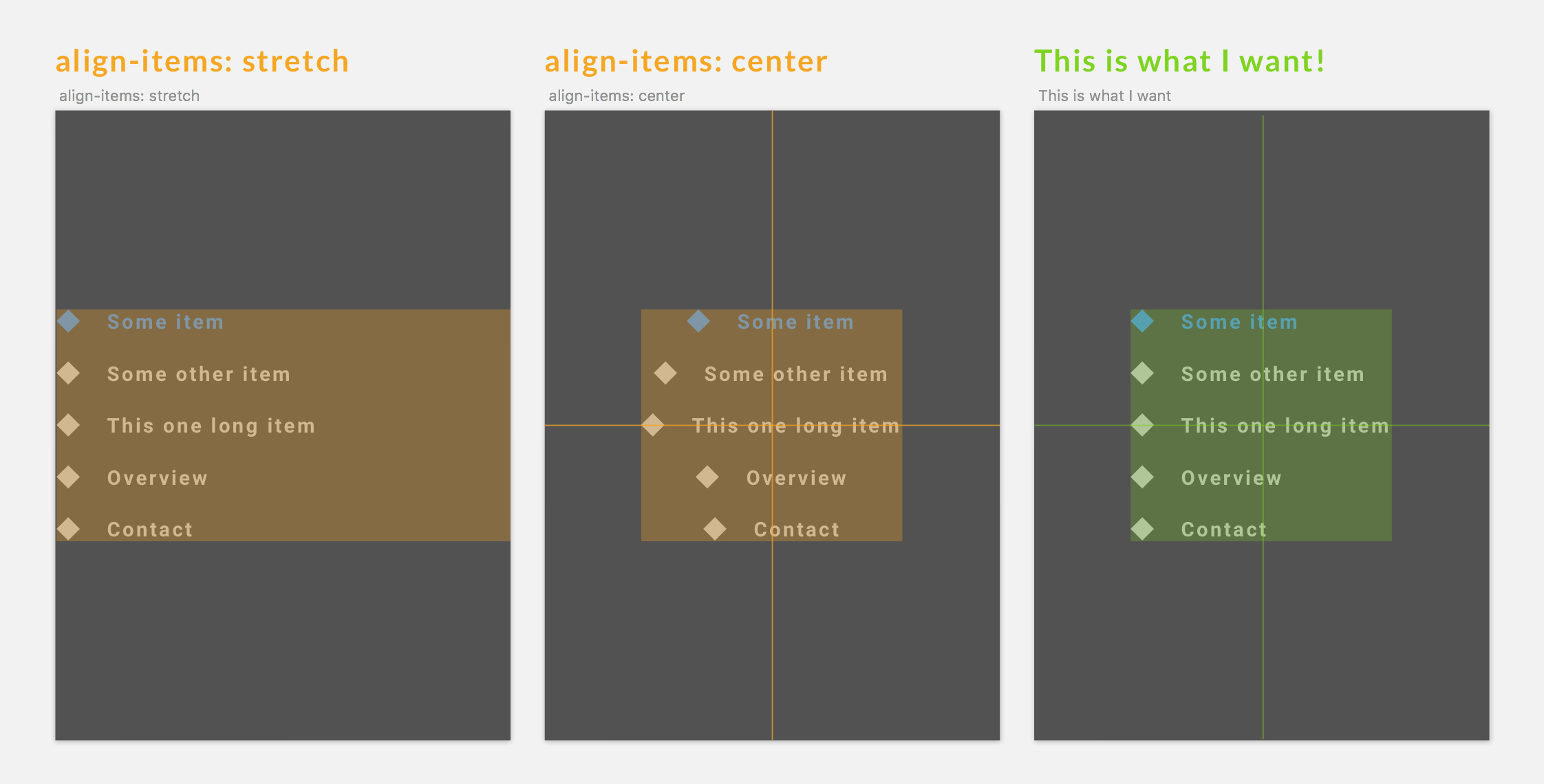 Flexbox的柱對齊項相同的寬度但不居中包裝物(CSS-只)
這是一個移動菜單,這當然需要是響應。
的最長孩子應設置寬度爲所有其他的孩子
.index需求是全寬度和高度與背景色。
只有 CSS,請
我想解決這個問題沒有額外的包裝。
我的代碼:
.index {

    position: fixed;

    top: 0;

    left: 0;

    width: 100%;

    height: 100%;

    display: flex;

    flex-direction: column; /* main-axis vertical */

    justify-content: center; /* main-axis alignment */

    align-items: center; /* neither center nor stretch produce desired result */

}

.index a {

    /* nothing important here */

}
<div class="index">
<a href="">Some item</a>
<a href="">Some other item</a>
<a href="">This one long item</a>
<a href="">Overview</a>
<a href="">Contact</a>
</div>我試過到目前爲止:
- 滿額填充在任父(
.index)或兒童(a)從來沒有全包爲中心的完美 - 與物品最大寬度玩耍了,但...
我想解決這個問題沒有一個額外的包裝。
在過去的幾個月中,我發現有很多關於原生Flexbox行爲的東西,我想知道並希望它能處理這個用例。
您是否嘗試過使用'填充「屬性y? – Roy123
正如我指出的,我試圖在父'.index'和孩子'a'上填充,並且從未跨多個視口寬度獲得整個框的完全居中對齊。但我可能是錯的。 –
基本上,沒有包裝的Flexbox是不可能的。 –