1
我正在製作一個完整版塊的頁面網站,如this。每個頁面都有自己的<section>標籤。目前我的網頁有4個部分(呈現不同的背景顏色)。如何在html中的section標籤內包含div標籤
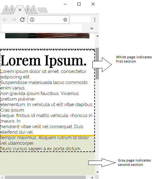
我的第一部分有一個容器div,裏面有兩個新的div(一個用於圖像,另一個用於描述)。現在,當窗口最小化時,說明內容溢出並轉到第二頁,而不是包含在第一頁中。舉例說明:
請讓我知道做了哪些更改。我一直在這個問題上很長一段時間,我還沒有找到一個資源或解決方案,爲我的代碼工作..
我的HTML代碼:
<!-- FIRST PAGE -->
<section>
    <div class="content" id="about">
    <!-- Picture -->
    <div id="aboutImage">
     <img src="img/about.jpeg">
    </div>

    <!-- Description -->
    <div id = "aboutInfo">

     <h2>Lorem Ipsum.</h2>

     <p>
     Lorem ipsum dolor sit amet, consectetur adipiscing elit. <br>
     Suspendisse malesuada lacus commodo enim varius, <br> non gravida ipsum faucibus.
     Vivamus pretium pulvinar <br> elementum. In vehicula ut elit vitae dapibus.
     Cras ipsum <br> neque, finibus id mattis vehicula, rhoncus in mauris.
     In <br> hendrerit vitae velit vel consequat. Duis eleifend dui vel <br> tempor
     maximus. Aliquam rutrum id dolor vel ullamcorper. <br> Nunc cursus sapien
     a ex porta dictum.
     </p>
    </div>
    </div>
</section>

<!-- SECOND PAGE-->
<section id="skills"></section>
我的CSS:
* {margin:0;padding:0;box-sizing:border-box}
html, body {width: 100%;}

* {box-sizing: border-box;}

html, body {
    height:100%;
    position: relative;
}

section{
    width: 100%;
    height:100vh;
}

.content{
    display: table-cell;
    height: 100vh;
}

/* ABOUT */
#about {
    border-bottom: #F1C40F 5px solid;

    display: flex;
    justify-content: space-evenly;
    align-items: center;
}

#aboutImage {
    padding: 30px 30px 30px 30px;
}

#aboutInfo {
    border-style: dashed;
    border-width: 2px;
    border-color: black;

    font-size: 30px;
    text-align: left;
}

#aboutInfo p {
    font-size: 15px;
}

/* SECOND PAGE*/
#skills {
    background-color: #E3E7D3;
}

/* RESPONSIVE DESIGN */
@media screen and (max-width: 768px){
    #about {
    flex-direction: column; /* added */
    }
}
請讓我知道如何解決這個問題。我一直有這麼多麻煩。
玩弄「溢出」 - 你可能會顯示它,當你想剪輯它,或使用滾動條。 – theGleep