2017-05-23 147 views
0

我用CSS做下面的圖片:CSS三角形和箱陰影

introducir la descripción de la imagen aquí

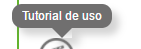
正如你所看到的,三角形的,削減從工具提示中的box-shadow差距。

的代碼如下:

/* Generated by less 2.5.1 */ 
 
* { 
 
    margin: 0; 
 
    padding: 0; 
 
    box-sizing: border-box; 
 
} 
 
/* Demo of the tool-tip CSS */ 
 
.tooltip { 
 
    text-decoration: underline; 
 
    color: #37b9b5; 
 
    cursor: default; 
 
} 
 
.tooltip-bubble { 
 
    position: absolute; 
 
    z-index: 1; 
 
    padding: 5px 10px; 
 
    color: #fff; 
 
    width: auto; 
 
    box-shadow: 7px 7px 11px 0px rgba(112, 111, 111, 0.3); 
 
    background-color: transparent; 
 
    border-radius: 10px; 
 
} 
 
.tooltip-bubble div { 
 
    position: relative; 
 
    z-index: 1; 
 
    font-size: 12px; 
 
} 
 
.tooltip-bubble::before { 
 
    position: absolute; 
 
    content: ''; 
 
    top: 0; 
 
    left: 0; 
 
    width: 100%; 
 
    height: 100%; 
 
    background-color: #706f6f; 
 
    border-radius: 10px; 
 
} 
 
.tooltip-bubble .arrow { 
 
    content: ''; 
 
    display: block; 
 
    position: absolute; 
 
    top: 100%; 
 
    left: 50%; 
 
    width: 0px; 
 
    height: 0px; 
 
    border-left: 10px solid transparent; 
 
    border-right: 10px solid transparent; 
 
    transform: translate(-50%, 0); 
 
    box-shadow: 7px 7px 11px 0px rgba(112, 111, 111, 0.3); 
 
} 
 
.tooltip-bubble .arrow.up { 
 
    top: -10px; 
 
    border-bottom: 10px solid #706f6f; 
 
    border-left: 10px solid transparent; 
 
    border-right: 10px solid transparent; 
 
} 
 
.tooltip-bubble .arrow.down { 
 
    border-top: 10px solid #706f6f; 
 
    border-left: 10px solid transparent; 
 
    border-right: 10px solid transparent; 
 
}
<div class="tooltip-bubble"><div>Tutorial de uso</div><div class="arrow down"></div></div>

我想透明的背景顏色,但它不工作。

回答

4

略有不同的方法,我只做了向下箭頭。

而不是使用CSS製作三角形,我創建了一個正方形並將其旋轉了45度。我可以用這種方法考慮的唯一缺點是工具提示氣泡的高度必須等於或大於箭頭寬度的一半。

您可能還想將箭頭上的陰影更改爲正方形的右側,而不是右下角,以便它在旋轉後起作用。

* { 
 
    margin: 0; 
 
    padding: 0; 
 
    box-sizing: border-box; 
 
} 
 
/* Demo of the tool-tip CSS */ 
 
.tooltip { 
 
    text-decoration: underline; 
 
    color: #37b9b5; 
 
    cursor: default; 
 
} 
 
.tooltip-bubble { 
 
    position: absolute; 
 
    z-index: 1; 
 
    padding: 5px 10px; 
 
    color: #fff; 
 
    width: auto; 
 
    box-shadow: 7px 7px 11px 0px rgba(112, 111, 111, 0.3); 
 
    background-color: transparent; 
 
    border-radius: 10px; 
 
} 
 
.tooltip-bubble div { 
 
    position: relative; 
 
    z-index: 1; 
 
    font-size: 12px; 
 
} 
 
.tooltip-bubble::before { 
 
    position: absolute; 
 
    content: ''; 
 
    top: 0; 
 
    left: 0; 
 
    width: 100%; 
 
    height: 100%; 
 
    background-color: #706f6f; 
 
    border-radius: 10px; 
 
} 
 
.tooltip-bubble .arrow { 
 
    background-color: #706f6f; 
 
    content: ''; 
 
    display: block; 
 
    position: absolute; 
 
    left: 50%; 
 
    height: 10px; 
 
    width: 10px; 
 
    transform: translate(-50%, 0) rotate(45deg); 
 
    box-shadow: 7px 7px 11px 0px rgba(112, 111, 111, 0.3); 
 
} 
 
.tooltip-bubble .arrow.down { 
 
    margin-top: -5px; 
 
    top: 100%; 
 
}
<div class="tooltip-bubble"><div>Tutorial de uso</div><div class="arrow down"></div></div>

+0

爲了避免這種缺點,你可以使用一個容器元素與'溢出:隱藏;'應用例如風格https://codepen.io/chriscoyier/pen/bNZWzK –

1

您可以使用轉換。他們pretty well supported現在

/* Generated by less 2.5.1 */ 
 
* { 
 
    margin: 0; 
 
    padding: 0; 
 
    box-sizing: border-box; 
 
} 
 
/* Demo of the tool-tip CSS */ 
 
.tooltip { 
 
    text-decoration: underline; 
 
    color: #37b9b5; 
 
    cursor: default; 
 
} 
 
.tooltip-bubble { 
 
    position: absolute; 
 
    z-index: 1; 
 
    padding: 5px 10px; 
 
    color: #fff; 
 
    width: auto; 
 
    box-shadow: 7px 7px 11px 0px rgba(112, 111, 111, 0.3); 
 
    background-color: transparent; 
 
    border-radius: 10px; 
 
} 
 
.tooltip-bubble div { 
 
    position: relative; 
 
    z-index: 1; 
 
    font-size: 12px; 
 
} 
 
.tooltip-bubble::before { 
 
    position: absolute; 
 
    content: ''; 
 
    top: 0; 
 
    left: 0; 
 
    width: 100%; 
 
    height: 100%; 
 
    background-color: #706f6f; 
 
    border-radius: 10px; 
 
    z-index: 1; 
 
} 
 
.tooltip-bubble .arrow { 
 
    content: ''; 
 
    display: block; 
 
    position: absolute; 
 
    top: 100%; 
 
    left: 50%; 
 
    width: 0px; 
 
    height: 0px; 
 
    border-left: 10px solid transparent; 
 
    border-right: 10px solid transparent; 
 
    transform: translate(-50%, 0); 
 
    box-shadow: 7px 7px 11px 0px rgba(112, 111, 111, 0.3); 
 
} 
 
.tooltip-bubble .arrow.up { 
 
    top: -10px; 
 
    border-bottom: 10px solid #706f6f; 
 
    border-left: 10px solid transparent; 
 
    border-right: 10px solid transparent; 
 
} 
 
.tooltip-bubble .arrow.down { 
 
    border: 7px solid #706f6f; 
 
    transform: rotate(45deg) translate(-50%, -50%); 
 
    transform-origin: 0 0; 
 
    z-index: 0; 
 
}
<div class="tooltip-bubble"><div>Tutorial de uso</div><div class="arrow down"></div></div>