0
我使用CSS繪製餅圖。噹噹前圖像不是從0度開始..HTML CSS餅圖定位不是從0度開始
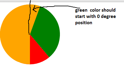
實際停止&預期輸出:綠色應度;紅色:度;橙:度
CSS:
<style>
/*
    make each pie piece a rectangle twice as high as it is wide.
    move the transform origin to the middle of the left side.
    Also ensure that overflow is set to hidden.
*/
    .pie {
     position:absolute;
     width:100px;
     height:200px;
     overflow:hidden;
     left:110px;
     -moz-transform-origin:left center;
     -ms-transform-origin:left center;
     -o-transform-origin:left center;
     -webkit-transform-origin:left center;
     transform-origin:left center;
    }
/*
    unless the piece represents more than 50% of the whole chart.
    then make it a square, and ensure the transform origin is
    back in the center.

    NOTE: since this is only ever a single piece, you could
    move this to a piece specific rule and remove the extra class
*/
    .pie.big {
     width:200px;
     height:200px;
     left:10px;
     -moz-transform-origin:center center;
     -ms-transform-origin:center center;
     -o-transform-origin:center center;
     -webkit-transform-origin:center center;
     transform-origin:center center;
    }
/*
    this is the actual visible part of the pie.
    Give it the same dimensions as the regular piece.
    Use border radius make it a half circle.
    move transform origin to the middle of the right side.
    Push it out to the left of the containing box.
*/
    .pie:BEFORE {
     content:"";
     position:absolute;
     width:100px;
     height:200px;
     left:-100px;
     border-radius:100px 0 0 100px;
     -moz-transform-origin:right center;
     -ms-transform-origin:right center;
     -o-transform-origin:right center;
     -webkit-transform-origin:right center;
     transform-origin:right center;

    }
/* if it's part of a big piece, bring it back into the square */
    .pie.big:BEFORE {
     left:0px;
    }
/*
    big pieces will also need a second semicircle, pointed in the
    opposite direction to hide the first part behind.
*/
    .pie.big:AFTER {
     content:"";
     position:absolute;
     width:100px;
     height:200px;
     left:100px;
     border-radius:0 100px 100px 0;
    }
/*
    add colour to each piece.
*/
    .pie:nth-of-type(1):AFTER,
    .pie:nth-of-type(1):BEFORE {
     background-color:green;
    }
    .pie:nth-of-type(2):AFTER,
    .pie:nth-of-type(2):BEFORE {
     background-color:red;
    }
    .pie:nth-of-type(3):AFTER,
    .pie:nth-of-type(3):BEFORE {
     background-color:orange;
    }
/*
    now rotate each piece based on their cumulative starting
    position
*/
    .pie[data-start="140"] {
     -moz-transform: rotate(140deg); /* Firefox */
     -ms-transform: rotate(140deg); /* IE */
     -webkit-transform: rotate(140deg); /* Safari and Chrome */
     -o-transform: rotate(140deg); /* Opera */
     transform:rotate(140deg);
    }
    .pie[data-start="200"] {
     -moz-transform: rotate(200deg); /* Firefox */
     -ms-transform: rotate(200deg); /* IE */
     -webkit-transform: rotate(200deg); /* Safari and Chrome */
     -o-transform: rotate(200deg); /* Opera */
     transform:rotate(200deg);
    }
/*
    and rotate the amount of the pie that's showing.

    NOTE: add an extra degree to all but the final piece,
    to fill in unsightly gaps.
*/
    .pie[data-value="140"]:BEFORE {
     -moz-transform: rotate(140deg); /* Firefox */
     -ms-transform: rotate(140deg); /* IE */
     -webkit-transform: rotate(140deg); /* Safari and Chrome */
     -o-transform: rotate(140deg); /* Opera */
     transform:rotate(140deg);
    }
    .pie[data-value="60"]:BEFORE {
     -moz-transform: rotate(60deg); /* Firefox */
     -ms-transform: rotate(60deg); /* IE */
     -webkit-transform: rotate(60deg); /* Safari and Chrome */
     -o-transform: rotate(60deg); /* Opera */
     transform:rotate(60deg);
    }
    .pie[data-value="160"]:BEFORE {
     -moz-transform: rotate(160deg); /* Firefox */
     -ms-transform: rotate(160deg); /* IE */
     -webkit-transform: rotate(160deg); /* Safari and Chrome */
     -o-transform: rotate(160deg); /* Opera */
     transform:rotate(160deg);
    }
/*
NOTE: you could also apply custom classes (i.e. .s0 .v30)
but if the CSS3 attr() function proposal ever gets implemented,
then all the above custom piece rules could be replaced with
the following:

.pie[data-start] {
    transform:rotate(attr(data-start,deg,0);
}
.pie[data-value]:BEFORE {
    transform:rotate(attr(data-value,deg,0);
}
*/
</style>
HTML:
<!--
for each piece of the pie chart create one div and give it
a data-value attribute that represents the amount (in degrees) that
represents its total visible portion, and a data-start attribute
that matches the amount rotation for the starting (the cumulative value amount of all the previous pieces).
-->
<div class="pie" data-start="0" data-value="140"></div>
<div class="pie" data-start="140" data-value="60"></div>
<div class="pie big" data-start="200" data-value="160"></div>
我的圖是動態的..將這項工作的任何角度,我設置? – logan
你可以使用你的屬性值[data-start =「200」]但jquery degree值 –
它不適用於紅色;紅色不是60deg 輸出應爲綠色140度;紅色:60度;橙色:160度; – logan