2017-07-04 168 views
1

我可以在下面的圖片上創建一個佈局,而只在父容器上設置固定寬度嗎?我也不能使用position: absolute; left: 0; right: 0;全屏寬度子,因爲我不能從流中刪除它,因爲它的大小是動態的。固定寬度佈局,一個孩子橫跨全屏寬度

我無法更改標記。

我能想到的唯一的解決辦法是設置在每個固定寬度的孩子分別固定寬度,但我有很多的人,這不是最舒適的解決方案 - 用於添加類爲每一個孩子說我添加到父容器中。

Desired layout

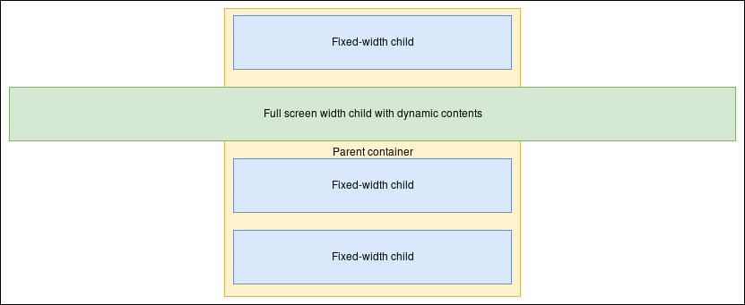
下面是一個例子標記您可以發佈一個解決方案。

HTML

<div class="fixed-width-container"> 
    <div class="regular-child"></div> 
    <div class="full-screen-width-child"></div> 
    <div class="regular-child"></div> 
    <div class="regular-child"></div> 
</div> 

CSS

.fixed-width-container { 
    width: <some-fixed-width>; 
} 
+0

相關 - https://stackoverflow.com/questions/28565976/css-how-to-overflow從全角到全角 –

+0

基本上,**除非**完整寬度的元素僅用於樣式...您不能單獨使用CSS來完成此操作,而不必在給定約束條件的情況下更改HTML 。 –

+0

@Paulie_D:這就是我的想法,但想確保我不會錯過任何東西。謝謝。 順便說一句我認爲CSS Grid可以做到這一點,但我們都知道到目前爲止它對它的支持程度如何。 –

回答

1

你可以給一個嘗試柔性佈局:https://css-tricks.com/snippets/css/a-guide-to-flexbox/

* { 
 
    margin: 0; 
 
    padding: 0; 
 
    box-sizing: border-box; 
 
    text-align: center; 
 
} 


body { 
 
    margin: 0; 
 
} 


div { 
 
    border: 1px solid #333; 
 
} 


.fixed-width-container { 
 
    width: 400px;/* any width set */ 
 
    margin: auto; 
 
    padding: 10px 10px 0; 
 
    background: yellow; 
 
    display: flex; 
 
    flex-flow: column; 
 
    align-items: center; 
 
} 


.fixed-width-container>div { 
 
    height: 3em; 
 
    margin-bottom: 10px; 
 
    background: lightblue; 
 
    min-width: 100%; 
 
} 


.full-screen-width-child { 
 
    width: 99vw;/* 100vw is fine too */ 
 
}
<div class="fixed-width-container"> 
 
    <div class="regular-child">Fixed-width child</div> 
 
    <div class="full-screen-width-child">Full screen width child with dynamic contents</div> 
 
    <div class="regular-child">Fixed-width child</div> 
 
    <div class="regular-child">Fixed-width child</div> 
 
</div>
codepen to test and play with

+0

確實可行!正是我在找的東西。謝謝!我製作了一支筆來試驗您的解決方案:https:// codepen。io/anon/pen/vZrNXm。你可以將它鏈接到你的答案;也許有人會發現它有幫助 –

+1

不幸的是'寬度:100vw;'引入了另一個問題 - 垂直滾動條(如此處所述:https://stackoverflow.com/questions/23367345/100vw-causing-horizo​​ntal-overflow-but-only-if - 更多 - 比 - 一個#23367686)。但是這個答案傳達了問題的所有標準,所以我不接受它。 –

+0

今天我想通了'html {overflow-y:scroll; }'用滾動條修復了這個問題。我建議將其添加到您的答案中。 –

0

這僅僅是一個嘗試,可能不是一個很好的一個。但也許它會產生一些更復雜的解決方案,其他人甚至是你自己。


理念:爲全寬子切緣陰性。

* { 
 
    box-sizing: border-box; 
 
    text-align: center; 
 
} 


body { 
 
    width: 100%; 
 
    background: #fff; 
 
} 


div { 
 
    border: 1px solid #333; 
 
    margin-bottom: 10px; 
 
} 


div:last-child { 
 
    margin-bottom: 0; 
 
} 


.fixed-width-container { 
 
    width: 70%; 
 
    margin: auto; 
 
    padding: 10px; 
 
    background: LightYellow; 
 
} 


.regular-child, 
 
.full-screen-width-child { 
 
    height: 45px; 
 
    line-height: 45px; 
 
    background: LightBlue; 
 
} 


.full-screen-width-child { 
 
    margin-left: -24%; 
 
    margin-right: -24%; 
 
    background: LightGreen; 
 
}
<div class="fixed-width-container"> 
 
    <div class="regular-child">Fixed-width child</div> 
 
    <div class="full-screen-width-child">Full screen width child with dynamic contents</div> 
 
    <div class="regular-child">Fixed-width child</div> 
 
    <div class="regular-child">Fixed-width child</div> 
 
</div>

這裏的問題部分是負利潤的尺寸。如果您使用%,它將與fixed-width-containerwidth相關。在這裏,我選擇了width: 70%。給定625px(如Stack Snippet預覽的情況)的機身寬度和-24%的邊距,這將給出625px * 0.7 * 0.24 = 105px的負邊距。我不確定在任何配置下進行這項工作的最佳方法是什麼。