0
A
回答
1
您可以用Flexbox的做(如果設置父固定的高度,例如100vh),但在這種情況下,這樣做的首選方法是用電網:
* {margin:0;padding:0;box-sizing:border-box}
html, body {width:100%}
#container {
display: grid;
grid-template-columns: 1fr 1fr; /* makes two columns, can also use 50% 50%, repeat(2, 1fr) or repeat(2, 50%), fr stands for fractions */
grid-auto-rows: 150px; /* adjust or don't use at all, not mandatory */
grid-gap: 5px 0; /* adjust, atm. 5px vertical gap, 0px horizontal */
color: #fff;
font-size: 4em;
font-weight: bold;
text-align: center;
}
#container > div:nth-child(2) { /* can also use :nth-of-type(2) */
grid-column: 1; /* puts the blue one in the left column */
grid-row: 1/3; /* span two rows */
}
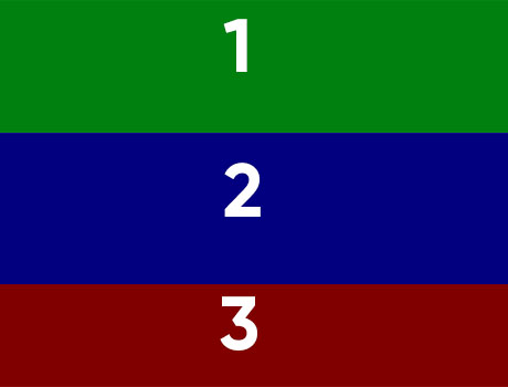
@media screen and (max-width: 568px) { /* adjust */
#container {
grid-template-columns: 1fr; /* makes one column, can also use 100% */
grid-gap: 0;
}
#container > div:nth-child(2) {
grid-row: 2; /* puts it back where it belongs */
}
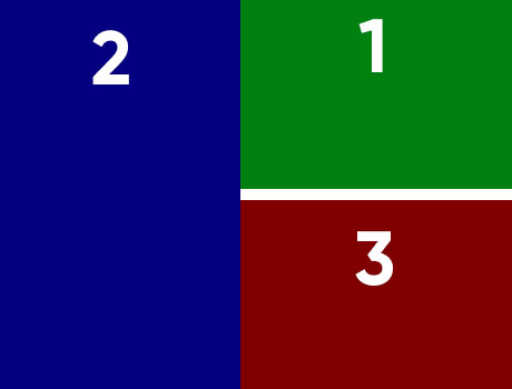
}<div id="container">
<div style="background: green">1</div>
<div style="background: blue">2</div>
<div style="background: red">3</div>
</div>至於替代,您可以採取的定位優勢:
* {margin:0;padding:0;box-sizing:border-box}

html, body {width:100vw;height:100vh} /* viewport units */


#container {

    position: relative; /* needs to be on the parent */

    height: 100%;

    color: #fff;

    font-size: 4em;

    font-weight: bold;

    text-align: center;

}


#container > div {

    position: absolute; /* needs to be on the children */

}


#container > div:first-child {

    top: 0;

    right: 0;

    width: 50%;

    height: 147.5px; /* -2.5px for the vertical gap */

}


#container > div:nth-child(2) {

    top: 0;

    left: 0;

    width: 50%;

    height: 300px;

}


#container > div:nth-child(3) { /* can also use the :last-child */

    top: 152.5px; /* height of the :first-child + 5px */

    right: 0;

    width: 50%;

    height: 147.5px; /* -2.5px for the vertical gap */

}


@media screen and (max-width: 568px) {

    #container > div {position:static}

    #container > div:first-child,

    #container > div:nth-child(2),

    #container > div:nth-child(3) {

    width: 100%;

    height: 150px;

    }

}
<div id="container">
<div style="background: green">1</div>
<div style="background: blue">2</div>
<div style="background: red">3</div>
</div>+0
有_many_ dupe可供選擇:) – LGSon
相關問題
- 1. flexbox四平鋪佈局
- 2. Flexbox拼貼網格佈局
- 3. white-space:nowrap打破flexbox佈局
- 4. 用flexbox設置佈局
- 5. Flexbox佈局對齊內容
- 6. Flexbox響應式佈局
- 7. Flexbox 4項目佈局
- 8. 基本佈局與CSS flexbox
- 9. Doctype中斷flexbox佈局
- 10. Flexbox的響應行列布局
- 11. Android的佈局包括沒有佈局
- 12. 使用Flexbox的CSS 2列表佈局
- 13. Flexbox的佈局查詢,行分列
- 14. 「聖盃」使用flexbox的三列布局
- 15. 長文本打破我的flexbox佈局
- 16. 用於頁面佈局的Flexbox?
- 17. 固定div的兩列flexbox佈局
- 18. 使用flexbox的非響應式佈局
- 19. Safari 8中的Flexbox佈局突破
- 20. 波本與flexbox的兩列布局
- 21. React flexbox對齊多組件佈局
- 22. Flexbox的欄佈局響應與列重新排序沒有固定的高度
- 23. 整版頁面/屏幕FLEXBOX佈局
- 24. CSS Flexbox響應式佈局和%寬度
- 25. 如何使用flexbox編寫此佈局?
- 26. Flexbox 2/1/2佈局兒童
- 27. css flexbox特殊2列布局
- 28. Flexbox響應式佈局對齊
- 29. 在flexbox佈局中疊加div div
- 30. Flexbox的佈局 - 多行如果有足夠長的
的又一可能複製https://stackoverflow.com/questions/41790378/css-flexbox-group-2-flex-items?rq=1 – LGSon
而另一個鏈接到一個問題,沒有一個公認的答案。也許我們這次可以找到答案,並在將來繼續關聯這個問題? :) – Aydin4ik
只是因爲一個答案沒有接受,並不意味着它不能被鏈接,只要鏈接的答案(s)有一個解決方案:) – LGSon