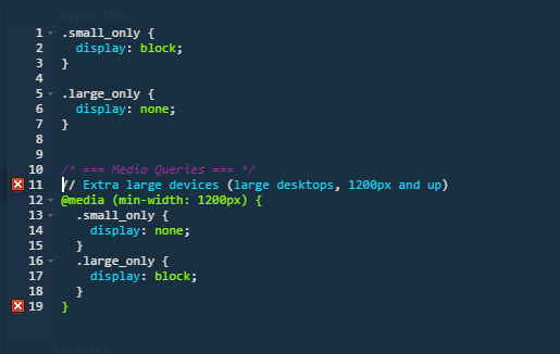
1
.small_only {

    display: block;

}


.large_only {

    display: none;

}


/* === Media Queries === */


// Extra large devices (large desktops, 1200px and up)

@media (min-width: 1200px) {

    .small_only {

    display: none;

    }

    .large_only {

    display: block;

    }

}
<div class="container">
<div class="row">
<div class="col-lg-12 col-xs-12">
<div class="small_only">
<h1>SMALL</h1>
</div>
<div class="large_only">
<h1>This should only be visible in large windows</h1>
</div>
</div>
</div>
</div>問題:輸出僅包含字「SMALL」無論屏幕有多寬。
我覺得我失去了一些明顯的東西,但對於我的生活,我無法弄清楚它是什麼。
謝謝。我將複製的代碼粘貼到bootstrap網站上的HTML模板中,並將其忘了。吮吸沒有一個CSS編譯器來捕捉那樣的愚蠢錯誤。 –
很高興工作!請接受答案,以便其他人知道已解決。 – ZimSystem
完成。我正在等倒數,直到我能接受答案。再一次,謝謝你。 –