2016-04-23 56 views
-1

爲了保持它們之間的空間,我想爲我的網站定位一些特定格式的div,然後向它們添加內容。我一直在對頁面進行響應,所以我想知道如果以這種方式定位這些div,並且響應性是可行的。我想它的結果可能是這樣的:如何使用CSS將div的位置設置爲這樣?

enter image description here

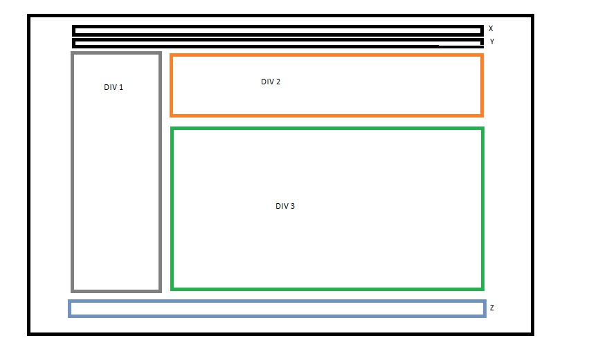
是X和Y兩個div的我已經創建(頁眉和菜單)和Z頁腳。 div的我喜歡把這些職位是那些DIV 1,DIV 2和DIV 3

眼下以上(標題和菜單)的兩個主要部分風格是這樣的:

* { 
    margin:0; 
    padding:0; 
    -webkit-box-sizing: border-box; 
    -moz-box-sizing: border-box; 
    box-sizing: border-box; 
} 

header { 
    width:90%; 
    height:30%; 
    margin: 0 auto; 
    background-color:darkblue; 
    color:white; 
    z-index: 105; 
    position:relative; 
} 

nav { 
    width:90%; 
    height:22%; 
    margin: 0 auto; 
    background-color:skyblue; 
} 

和HTML我有一刻對於那些DIV 1,DIV 2和DIV 3是這樣的:

<div id="content"> 
    <div id="leftinfo"> 
     <ul> 
      <li>INFO</li> 
      <li>ABOUT</li> 
     </ul> 
    </div> 


    <div id="hcontent"> 
     <div class="tophcontent"> 

     </div> 
    </div> 


    <div id="hcontent2"> 
     <p></p> 
    </div> 
</div> 

我一直在掙扎於如何定位它像這樣,維持與其他div的網絡流量。任何有關它的幫助或提示將非常感激。

+0

你的意思是可擴展的,其這些div resize在按比例基礎上,屏幕寬度? –

+0

是的,並將DIV1列放在內容的兩個水平分區旁邊。謝謝。 – Jim

+0

發佈你一個完全動態的答案,無論內容是小還是大,都會增長/填充頁面。 – LGSon

回答

1

下面是使用display: flex樣品。它今天有大約94%的瀏覽器支持,我認爲可以考慮非常好。

與此相關的一個很大的好處是,與floatinline-block版本相比,每個元素的內容都是完全動態的。

html, body { 
 
    margin: 0; 
 
    height: 100%; 
 
    min-height: 100%; 
 
} 
 
* { 
 
    box-sizing: border-box; 
 
} 
 
.container { 
 
    min-height: 100%; 
 
    display: flex; 
 
    flex-direction: column; 
 
} 
 
.info, .about, .content-left, .content-right-top, 
 
.content-right-bottom, .footer { 
 
    border: 1px solid; 
 
} 
 
.wrapper { 
 
    flex: 1; 
 
    display: flex; 
 
    min-height: 100%; 
 
} 
 
.content-left, .wrapper-inner { 
 
    flex: 1; 
 
} 
 
.wrapper-inner { 
 
    display: flex; 
 
    flex-direction: column; 
 
    min-height: 100%; 
 
} 
 
.content-right-top, .content-right-bottom { 
 
    flex: 1; 
 
}
<div class="container"> 
 
    <div class="info"> 
 
    Info<br> 
 
    2 lines 
 
    </div> 


    <div class="about"> 
 
    About<br> 
 
    in<br> 
 
    3 lines 
 
    </div> 


    <div class="wrapper"> 
 
    <div class="content-left"> 
 
     Left take all the rest of the space 
 
     Left take all the rest of the space 
 
     Left take all the rest of the space 
 
     Left take all the rest of the space 
 
     Left take all the rest of the space 
 
     Left take all the rest of the space 
 
     Left take all the rest of the space 
 
     Left take all the rest of the space 
 
     Left take all the rest of the space 
 
    </div> 
 
    <div class="wrapper-inner"> 
 
     <div class="content-right-top"> 
 
     Right - Top 
 
     Right - Top 
 
     Right - Top 
 
     Right - Top 
 
     Right - Top 
 
     Right - Top 
 
     Right - Top 
 
     Right - Top 
 
     </div> 
 
     <div class="content-right-bottom"> 
 
     Right - Bottom 
 
     Right - Bottom 
 
     Right - Bottom 
 
     Right - Bottom 
 
     Right - Bottom 
 
     Right - Bottom 
 
     Right - Bottom 
 
     </div> 
 
    </div> 
 
    </div> 


    <div class="footer"> 
 
    Footer<br> 
 
    has 2 lines 
 
    </div> 
 
</div>

3

我猜你想要的東西,像

https://jsfiddle.net/2dxzr1mv/3/

*{ 
    box-sizing:border-box; 
    white-space: nowrap; 
} 
div{ 
    padding:0; 
    margin:0; 
} 
.div1{ 
    width:20%; 
    height:100%; 
    background-color:red; 
    min-height:100vh; 
    display:inline-block; 
} 
.wrapper{ 
    width:80%; 
    min-height:100vh; 
    display:inline-block; 
} 
.div2,.div3{ 
    width:100%; 
    min-height:50vh; 
    background-color:yellow; 
    word-wrap: break-word; 
    overflow:hidden; 
    white-space: normal; 
} 
.div3{ 
    background-color:blue; 
} 
+0

這是一個很好的答案,謝謝。然而,在DIV2中,我的臨時文本離開了div。如何糾正? – Jim

+0

在你的div2中使用word-wrap:break-word – QoP

+0

我沒有得到它的糾正,但謝謝你的答案。 – Jim

2

我已經試過類似的圖片。

CSS

* { 
    margin:0; 
    padding:0; 
    -webkit-box-sizing: border-box; 
    -moz-box-sizing: border-box; 
    box-sizing: border-box; 
} 
body { 
    position: absolute; 
    top: 0; 
    left: 0; 
    right: 0; 
    bottom: 0; 
} 
#content { 
    table-layout: fixed; 
    display: table; 
    width: 100%; 
    height: 100%; 
} 
#content > div { 
    display: table-cell; 
} 
.tophcontent { 
    height: 40px; 
    margin: 0 10px; 
    border: 2px solid orange; 
} 
.midhcontent { 
    margin: 10px; 
    margin-bottom: 0; 
    height: calc(100% - 46px); 
    border: 2px solid green; 
} 
#leftinfo { 
    border: 3px solid gray; 
    width:120px; 
} 

HTML

<div id="content"> 
    <div id="leftinfo"> 
     <ul> 
      <li>INFO</li> 
      <li>ABOUT</li> 
     </ul> 
    </div> 


    <div id="header"> 
     <div class="tophcontent"> 
     </div> 
     <div class="midhcontent"> 
     </div> 
    </div> 
</div> 

這裏是我的JSfiddle

+0

這不允許我在div亂動時添加內容到「.tophcontent」和「.midhcontent」。任何想法如何糾正? – Jim

+0

@Jim一切都很好https://jsfiddle.net/us2mhL9v/7/,但我已將「.tophontent」的高度設置爲「40px」,因此文本會垂直溢出「DIV」。 – 2016-04-23 14:22:28

1

難道這樣的事情,你是什麼意思?

Codepen example

body, html{ 
    height:100%; 
} 

#wrapper{ 
    position:relative; 
    width: 90%; 
    height:100%; 
    margin:0 auto; 
} 

.left{ 
    float:left; 
    width:30%; 
    height:100%; 
    background:green; 
} 

.top-right{ 
    position:absolute; 
    right:0; 
    left:31%; 
    height:30%; 
    float:left; 
    background:blue; 
} 

.bottom-right{ 
    position:absolute; 
    right:0; 
    left:31%; 
    bottom:0; 
    top:32%; 
    float:left; 
    background:red; 
}