4
我有一個1920x550px的大背景圖像,我想直接在它下面放置一個div。 因爲我不知道如何顯示完整的圖像,我用了一個卑鄙的手段,實際上有透明的部分,因此它是1920×1080的圖像填充的圖像,然後我這個顯示它:背景圖像下的位置DIV,無論視口(響應)
.bg-image-big{
    background: url(../images/header-bg-big.png) no-repeat center center fixed;
    background-color: #f7f7f7;
    -webkit-background-size: cover;
    -moz-background-size: cover;
    -o-background-size: cover;
    background-size: cover;
}
這延伸到始終全屏。 現在有兩個問題:這不適用於手機(裁剪圖像),我不知道如何將內部div完全放在實際橫幅的「結尾」下方。在理論上和一個1920x1080的屏幕,它是一個550px的邊緣。
<div class="section bg-light-gray bg-image-big">
    <div class="inner">
     <!-- placed right under the end of the banner -->
    </div>
</div>
任何更好的方法(相當有把握)。任何暗示讚賞!
對於這件事,我使用Bootstrap3和FullPage.js
//編輯:
可視化的每個請求:
我想要什麼: 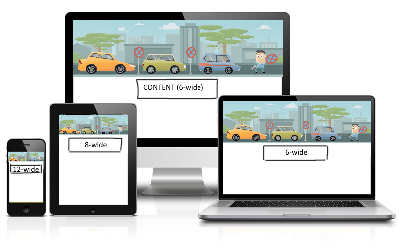
我有什麼: Full Desktop 
響應 
這不是關於6/8/12寬,而是關於那些元素的位置。 希望這有助於更多一點......
請編輯您的問題,並1.添加所需的輸出或2.添加更多有意義的描述的可視化表示,因爲這是也不夠明確 – Trix
我們將不勝感激一個的jsfiddle演示和屏幕截圖電流與期望輸出的關係。我建議你不要在圖像中添加「空白區域」並查看它的大小,PNG文件已經太大了,只能使用JPEG格式而沒有間距。至於在圖像下製作一個div,你可以在**你的bg-image-big而不是** INSIDE **下創建一個'div',如果這不是一個選項,那麼你必須去對於'inner' div,'position:absolute; bottom:0'的方式。需要更多信息。 – Aziz
爲什麼不使用常規的![]() 標籤,並將您的內容放在它之後;然後定位你想要的東西用正則css –
RGLSV
標籤,並將您的內容放在它之後;然後定位你想要的東西用正則css –
RGLSV