0
A
回答
1
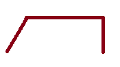
使用僞元素應該得到你想要的效果。
這不是最好的,但它是一個很好的起點,讓你在路上。
div {

    margin-left: 20px;

    border-top: 2px solid darkred;

    border-right: 2px solid darkred;

    height: 30px;

    display: inline-block;

    background: white;

    width: auto;

    padding: 0 10px 0 0;

    line-height: 30px;

    position: relative;

}

div:before {

    position: absolute;

    top: 5px;

    left: -11px;

    content: '';

    width: 35px;

    height: 35px;

    transform: rotate(30deg);

    background: transparent;

    border-left: 2px solid darkred;

}
<div>Some text</div>另一種方法是使用SVG其是超級簡單並且使用座標,使所期望的形狀。
<svg width="100px" height="30px" viewbox="0 0 100 30" preserveAspectRatio="none">

    <path d="M5,25 L20,5 L95,5 L95,25" stroke="darkred" stroke-width="5" fill="white" />

</svg>相關問題
- 1. 輪廓形狀
- 2. 右梯形輪廓形狀(具有透明度)
- 3. 生成梯形運動輪廓的位置設定點
- 4. 輪廓漸變 - css
- 5. css輪廓左右
- 6. 活動輪廓(蛇)梯度體面
- 7. 輪廓與cartopy:ValueError:無效的變換:不支持球形輪廓
- 8. 用輪廓填充圓形
- 9. OpenGL繪製矩形輪廓
- 10. 空心菱形輪廓
- 11. CSS輪廓總是對鉻
- 12. OpenGL中的輪廓非凸多邊形
- 13. HTML中的彎曲按鈕輪廓CSS
- 14. 響應式CSS框/矩形頂部拱形和輪廓
- 15. 輪廓輪廓着色器
- 16. 從輪廓中提取最外輪廓
- 17. 搜索輪廓內的輪廓/ OpenCV C++
- 18. 獲取一組矩形的輪廓
- 19. 帶網格的三角形輪廓
- 20. 使線跟隨形狀的輪廓
- 21. openCV檢測輪廓內的形狀
- 22. 查找相鄰多邊形的輪廓
- 23. 帶輪廓線的三維圖形
- 24. 用圖形繪製窗體的輪廓
- 25. 使用Matlab的鋸齒形輪廓2014b
- 26. Java:製作多個形狀的輪廓
- 27. 帶有邊框css的輪廓div?
- 28. 僅圍繞父元素的CSS輪廓
- 29. 圓角與CSS的梯形
- 30. 輪廓匹配 - 找到輪廓位移
僅與邊框的顏色充滿了一樣? – PeeHaa
相關 - http://stackoverflow.com/questions/19248443/is-it-possible-to-create-an-angled-corner-in-css/30729446#30729446(用於'.shape:before'的相同方法沒有'border-radius'就可以工作)。 – Harry
上述評論(或)在第一個重複線程中使用的答案(在頂部的通知中)將使用上述方法。你只需要在需要的邊上設置邊框。 – Harry