2012-02-07 33 views
45

我使用下面的風格連同一套九個補丁圖像來創建一些Ice Cream Sandwich的標籤,而不是標準的藍線底部的紅線:如何設計冰淇淋三明治標籤之間的分隔線?

<style name="customTabStyle" parent="@android:style/Widget.Holo.ActionBar.TabBar"> 
    <item name="android:tabStripLeft">@null</item> 
    <item name="android:tabStripRight">@null</item> 
    <item name="android:tabStripEnabled">false</item> 
    <item name="android:showDividers">none</item> 
    <item name="android:measureWithLargestChild">true</item> 
    <item name="android:background">@drawable/tab_line</item> 
    <item name="android:gravity">center</item> 
</style> 

<style name="customTabBar" parent="@android:style/Widget.Holo"> 
    <item name="android:showDividers">middle</item> 
    <item name="android:divider">@drawable/divider2</item> 
    <item name="android:dividerPadding">0dp</item> 
</style> 

<style name="LightThemeSelector" parent="android:Theme.Holo.Light"> 
    <item name="android:actionBarTabStyle">@style/customTabStyle</item> 
    <item name="android:actionBarTabBarStyle">@style/customTabBar</item> 
</style> 

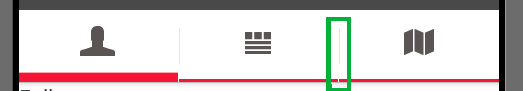
紅線所示除了選項卡之間的分隔符之外,每個選項都很好看。 正如您可以在圖像中的綠色框內看到的那樣,該線不會被劃分到分隔線之下。 我該如何選擇一個drawable,或者這個divider的風格?
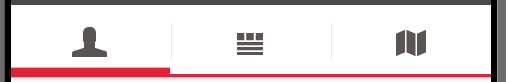
android:dividerandroid:showDividers項目不負責選項卡之間的分隔符。他們只選擇在選項卡圖標和選項卡標題之間繪製的分隔線。我隱藏了這些分頻器,因爲沒有標題,分頻器看起來很奇怪。

Screenshot from the resulting tab bar


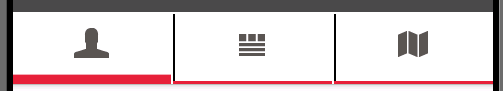
更新從Aneal記住我添加了第二個風格customTabBar答案。樣式選擇一個drawable作爲分隔符。分頻器與以下9patch繪製創造了一個黑色實線:

9patch drawable creating the divider

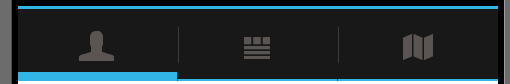
有了這個可繪製的隔板被繪製,但也有一個空行旁邊:

tab bar with dividers

+0

問題在於你的問題九個補丁。如果您在SDK中搜索「list_divider_holo_」,您會發現用於ActionBar選項卡分隔符的所有九個補丁。如果你想做一個準確的,我會用SDK中的一個作爲模板。你也可以嘗試調整填充。 – adneal 2012-02-07 08:53:03

+0

我的9個補丁可繪製沒有問題。按照您的建議使用SDK中的drawable可以獲得相同的結果。 – Janusz 2012-02-07 09:06:45

+0

嗯。像這樣想。如果你對所有東西都使用默認的drawable,分隔線就會正確排列,因此,你改變的東西就是這裏的罪魁禍首。如果它不是九個補丁,那麼也許它是你的標籤。我不知道,我無法測試你正在使用的繪圖板,在這裏也沒有其他人可以。如果我是你,我會開始檢查列表中的東西,看看他們爲什麼偏離中心。檢查你的風格和drawables。 – adneal 2012-02-07 09:11:27

回答

51

消除各種風格我用我下面的圖片後:

enter image description here

此圖像還包含小的差距。因此,這似乎是某種默認行爲。

但是我找到了解決這個問題的方法。我將紅線設置爲整個標籤欄的標準背景。這樣就會出現間隙,但沒有人可以看到它,因爲顯示了已包含該行的背景。

我現在使用下面的風格對我的所有活動:

<style name="LightThemeSelector" parent="android:Theme.Holo.Light"> 
    <item name="android:actionBarTabBarStyle">@style/customTabBar</item> 
    <item name="android:actionBarTabStyle">@style/customTabStyle</item> 
</style> 

這種風格用於樣式化的TabBar內的每個單獨的標籤:

<style name="customTabStyle" parent="@android:style/Widget.Holo.ActionBar.TabView"> 
    <item name="android:showDividers">none</item> 
    <item name="android:measureWithLargestChild">true</item> 
    <item name="android:background">@drawable/tab_line</item> 
    <item name="android:gravity">center</item> 
</style> 

款式整體的TabBar我使用以下風格:

<style name="customTabBar" parent="@android:style/Widget.Holo.ActionBar.TabBar"> 
    <item name="android:showDividers">middle</item> 
    <item name="android:divider">@drawable/divider</item> 
    <item name="android:dividerPadding">0dp</item> 
    <item name="android:background">@drawable/tab_unselected</item> 
</style> 

此樣式定義了我的自定義分隔線,還定義了ba用於tabbar的ckground。作爲背景,我直接設置如果未選中選項卡,繪製的九個可修補繪圖。 所有這些的結果都是帶有紅色下劃線的標籤欄,沒有任何間隙。

enter image description here

+0

我應該如何使這種風格兼容2.x操作系統? – 2012-09-28 11:32:47

+2

您應該使用ActionBarSherlock – Richard 2012-10-30 10:03:04

+0

,但對於Widget.Holo.ActionBar.TabView,沒有屬性作爲measureWithLargestChild,android:gravity,android:showDividers。 – 2014-03-19 06:39:21

22

在這裏,你去。

<style name="YourTheme" parent="@android:style/Theme.Holo.Light"> 
    <item name="android:actionBarTabBarStyle">@style/Divider</item> 
</style> 

<style name="Divider" parent="@android:style/Widget.Holo.ActionBar.TabBar"> 
    <item name="android:divider">@drawable/your_divider_drawable_here</item> 
    <item name="android:showDividers">middle</item> 
    <item name="android:dividerPadding">12dip</item> 
</style> 
+1

您的代碼只會隱藏分隔符。但它是一個開始 – Janusz 2012-02-07 08:14:20

+0

什麼?只需將「@null」更改爲任何你想要的。當我測試它時,我將它們隱藏起來以確保它正在工作。這正是你需要的。請檢查答案,如果你接受它。 – adneal 2012-02-07 08:16:46

+0

似乎試圖覆蓋任何TabBar樣式的屬性不起作用。至少對於ActionBarSherlock。 – toobsco42 2013-10-26 07:53:01

6

如果你想擺脫分隔的你可以這樣做只是這一點:

<style name="customTabBar" parent="@android:style/Widget.Holo.ActionBar.TabBar"> 
    <item name="android:divider">@null</item> 
</style> 
+0

我試過這個,並沒有爲我工作。在我的情況下,父母是'parent =「@ style/Widget.Sherlock.ActionBar.TabBar」'這是一個ActionBarSherlock風格。 – toobsco42 2013-10-26 07:27:32

6

順便說一句。這是由ICA中LinerLayout類實現android:divider屬性中的巨大錯誤引起的。它是在Honeycomb中引入的,在ICS中破解並再次在Jelly Bean中工作。

問題是,當你使用android:divider時,它會在它的子空間之間留出一個小的空間來放置分隔符,但是把divider放到這個空間中,但是在它之後,它會被tab自身重疊並且空間將保持爲空。非常愚蠢的錯誤。嘗試比較版本4.0和4.1的LinerLayout源代碼。

而且,解決方案將分隔符置於所有選項卡的背景中,並且只有在由此錯誤引起的選項卡之間的間隙中才可見。

1

基於ATom's answer,這是一種在所有Android版本中都有類似分隔線的方法。

爲了使這個工作,你不使用任何本地divider方法(因爲它們在某些版本中被打破)。不要忘記在設置分頻器的地方刪除任何代碼。

訣竅是在每個選項卡的視圖中設置一個非常小的右邊距。這樣,你就可以看到背景(TabHost)。要完成此操作,請在TabHost上設置背景以模仿拉伸分隔線。

雖然這個竅門並不適用於您可能想要的所有可能的設計,但它適用於許多情況下,如我所擁有的。

這裏是一個示例實現:

@Override 
public View onCreateView(LayoutInflater inflater, ViewGroup container, Bundle savedInstanceState) { 

    // ... 
    //  inflate or create tabHost in code 
    //  call tabHost.setup 
    // ... 

    TabWidget tabWidget = tabHost.getTabWidget(); 
    tabWidget.setBackgroundResource(R.drawable.tab_divider); 

    // ... add tabs 

    for(int i = 0; tabWidget.getChildCount()-1; i++) { 
     View view = tabWidget.getChildAt(i); 
     LinearLayout.LayoutParams layoutParams = (LinearLayout.LayoutParams) view.getLayoutParams(); 
     layoutParams.rightMargin = getResources().getDimensionPixelSize(R.dimen.tab_divider_width); //1dp 
     view.setLayoutParams(layoutParams); 
    } 
    return tabHost; 
} 

這裏的tab_divider繪製一個樣本:

<?xml version="1.0" encoding="utf-8"?> 
<shape 
    xmlns:android="http://schemas.android.com/apk/res/android" 
    android:shape="rectangle"> 
     <solid android:color="@color/divider_color" /> 
     <stroke android:width="@dimen/tab_divider_vertical_padding" 
       android:color="@color/tab_background_color"/> 
</shape> 
8
<style name="AppTheme" parent="AppBaseTheme"> 
    <item>...... 
    </item> 
    <item name="android:actionBarDivider">@null</item> 

</style> 

這裏@null是不提供任何分隔 ,如果你想自定義您的divider than use @ drawable/your_divider_image

相關問題