2017-09-26 222 views
-1

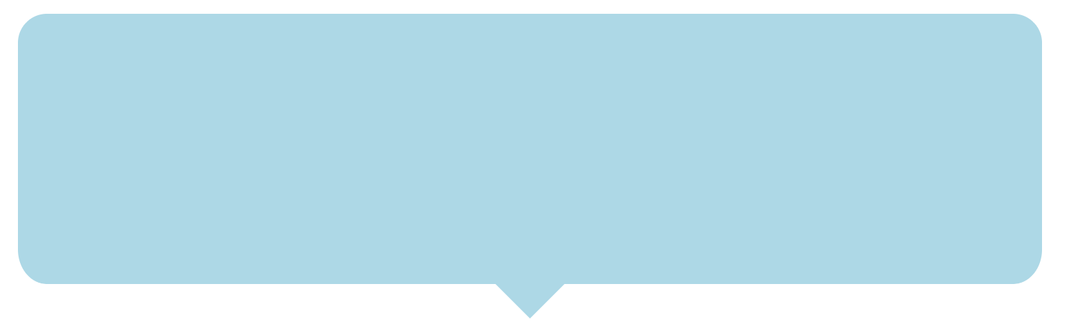
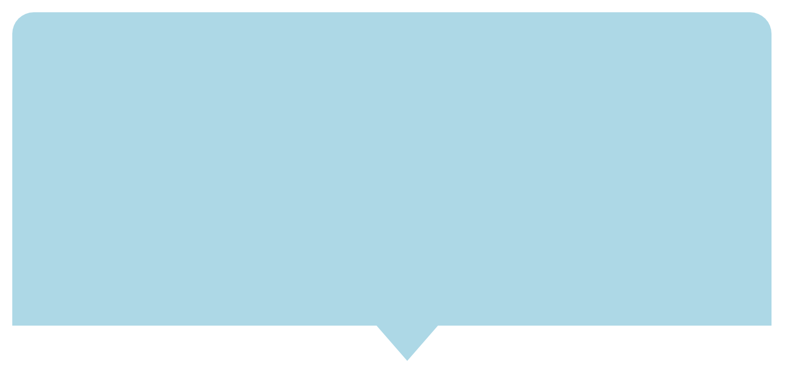
Goal is to achieve this.單擊鏈接。帶曲線邊緣的剪輯路徑多邊形

我到了這裏。如何彎曲底部邊緣?任何幫助表示讚賞。

I got till here.

 
    div class="curved-message"/> 

.curved-message{ 
    background: 'lightblue'; 
    clip-path: polygon(0% -20%, 100% 0%, 100% 90%, 56% 90%, 52% 100%, 48% 90%, 0% 90%); 
    border-radius: 25px; 
    margin-top: 250px; 
    height: 345px; 
    border-top: 4px solid white; 
    border-left: 4px solid white; 
    border-right: 4px solid white; 
    max-width:750px; 
} 

+0

爲什麼這個問題已關閉投票。 – Kumaran

回答

2

也許另一種方式來做到這一點?

.curved-message { 
 
    position: relative; 
 
    width: 300px; 
 
    height: 100px; 
 
    background: lightblue; 
 
    border-radius: 15px; 
 
} 
 
.curved-message:before { 
 
    content: ""; 
 
    width: 30px; 
 
    height: 30px; 
 
    background: lightblue; 
 
    position: absolute; 
 
    bottom: -15px; 
 
    left: 50%; 
 
    -webkit-transform: translateX(-50%) rotate(45deg); 
 
    transform: translateX(-50%) rotate(45deg); 
 
}
<div class="curved-message"> 


</div>

+0

謝謝亨利。不幸的是,與我們的代碼無法使用-webkit相關的樣式。 – Kumaran

+0

我接受這個答案。修改我的配置使用-webkit :-) – Kumaran